ADVANCED TYPOGRAPHY // TASK 1 Exercises

23.08.2021 -20.09.2021 (Week 1-Week 5)
Chaw Zhi Ting (0347344)Bachelor of Design (Hons) Creative Media
Advanced Typography // Task 1 Exercises
LECTURES :
Week 1/ Introduction & Briefing
Key notes:
1.
Sketch 3-10 layout (digest the information)
2.
Structure
3.
Determine Hierarchy
4.
Determine Typeface (Headline++) use one
typeface/ a sanserif & serif)
*Font-size: 8-12 pt
*Leading : 2-3 pt more then font
*Only TITLE can go beyond 12pt.
* Point size 10, Leading 12.5
* Paragraph spacing follow the leading 12.5 pt
to achieve 'cross alignment'
AdvTypo_0
Mr Vinod briefed us the new module and
introduced us the brand new learning
style
As we can see from the module name itself is
' Advanced Typography', this semester we are
not encouraged to rely on the lectures
feedbacks, instead be independent learning
with peers in a group and present the topic
ideas to the target audience
5 slides - written content
1-2 images on slides (visual)
3 major question : opinion/
Typographic Systems
"All design is based on a structural system"
-Elam
Elements are dependent on
communication in order to function
(hierarchy, reading order, legibility and
contrast)

1. Axial - all elements are
organized to left or right of single
axis
Example: trunk of tree, flower
stems (can be horizontal/vertical/
diagonal/shaped axis)

Figure 1.1 Example of axial system
by Odermatt &Tissi (1980), 23rd Aug 2021

Figure 1.2 Example of axial system by Jeremy Borthwick, 23rd Aug 2021
2. Radial : all elements
are extended from a point of focus
Example: sun, flower petals, fireworks, starfish (top to bottom/ bottom to top/right side up/upside down )
Example: sun, flower petals, fireworks, starfish (top to bottom/ bottom to top/right side up/upside down )

Figure 1.3 Radial system by Paula Scher (1996),23rd Aug 2021
3. Dilatational: expand in
regular or rhythmical increment from the center
point
Example: waves created when a pebble
dropped into still water (can be a few-layer, depends of
hierarchy)

Figure 1.4 Example of dilatational system by Stein and Ott(1984),23rd Aug 2021
4. Random: arrangement without
specific pattern, rule or relationship
Example: cropping, overlapping, placing
odd angles

Figure 1.5 Example of random system by
David Carson ,23rd Aug 2021
5. Grid: vertical and
horizontal divisions
Examples: window, crossword,
puzzle (manuscript grid, column, modular,
hierarchical grid)

Figure 1.6 Example of grid system by Josef Muller Brockmann (1950),23rd Aug 2021
6. Transitional : informal
system with shifted bands and layers
Examples: casually stacked wood (move
freely left and right)
Figure 1.7 Example of transitional system
by David Carson (1996),23rd Aug 2021
7. Modular: A series of non
objective elements that are constructed in as
a standardized units (move it around with
2 base units)
Examples: building blocks, storage
containers, component systems ( square,
circles, ellipse, triangles)

Figure 1.8 Example of modular system by Mike Plymale ,23rd Aug 2021
8. Bilateral: All text is arrange
symmetrically on a single axis
Examples: butterfly, leaves (can be 2 bilateral axis)

Figure 1.9 Example of bilateral system by Odermatt &Tissi(1992),23rd Aug 2021
"Each system have it's own strength and
restriction, so it needs to be use wisely
depends on the content."
AdvTypo_Ex (Tutorial)

Figure 2.0 Axial tutorial,25th Aug 2021

Mr.Vinod demonstrated how to start the
exercise by adding columns and gridline,
pasting the information given then
arrange the text one by one.
Revision/ Tips:
Shift + enter (to follow the leading)
Unit & Increment (change
kerning/tracking to 5mm)
*Before changing to small capitals
(needs to be lover case
*En dash (Ctrl +- ) : a long dash for
time
*Gutter (spaces between 2 column =
column intervals)

Figure 2.0 Axial tutorial,25th Aug 2021

Figure 2.1 Modular tutorial,25th Aug 2021


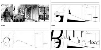
Figure 1.9 Example of environmental grid,1st Sept 2021

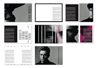


Figure 2.1 Example of "What we do in Shadows",6th Sept 2021

Figure 2.2 Evolution of the Alphabet,13th Sept 2021


Figure 2.5 Early Greek,5th C.B.C.E.
Figure 2.6 Roman Uncials,4th C.English Half Uncials

Figure 2.7 English Half Uncials,8th C.
Figure 2.8 Carolingian Minuscule
Black Letter
Figure 2.9 Black letter,12-15 C. CE

Figure 3.0 The Italian Renaissance
Figure 3.1 Movable Type, 11 C.—14 C.
Ad Typo_2
Principle of design composition: Emphasis, isolation, symmetry and asymmetry, alignment is more easier to achieve when in typographic layouts, For notions like repetition and perspective which is less conducive when it is translated.
Rule of thirds : A frame can be divided into 3 columns and 3 rows, the intersecting point will be the important text.
Grid system, also known as Raster System is the most used typographic system which derived from the grid compositional structure of Letter Press printing. It may seem old and rigid but the modular nature allow designs to be adaptable.
Post-modernist: randomness, asymmetry and chaos


Figure 1.8 Artwork from Paula
Scher(left) and David Carson
(right), 1st Sept 2021
Environmental Grid: exploration
of an existing structure or numerous
structure combined. Designer utilized
the crucial lines both curved and
straight to organize the information
in a unique and exciting way.

Figure 1.9 Example of environmental grid,1st Sept 2021
Form and movement: encourage
exploration from existing grid system
to dispel the seriousness. Care need
to be taken to ensure visual
connections and surprises. When new
elements such a images and colour or
text are added, the level of
complexity increases.


Figure 2.0 Example of form and
movement,1st Sept 2021
Use of extraction type in movie poster:


Figure 2.1 Example of "What we do in Shadows",6th Sept 2021
Ad Typo_3 Context & Creativity
This lecture explained how handwriting back then influenced typography today. Then Mr.Vinod walked us through the historical evolution of the Latin Alphabet which starts from cuneiform, hieroglyphics, and so on. For decades, Asia/East has neglected its written heritage. It is tough to create the old text in printed form by adapting western printing technologies such as letterpress, linotype, Unicode). However, with a mild renaissance in the East, with the advent of computer programmers in large numbers, now we could see the indigenous scripts on electronic devices.
Handwriting
1. First mechanically produced letterforms, becoming the basis of standard for form, spacing and conventions
2. Shape and line of hand drawn letterforms are influenced by tools (plant stem, sticks, sharpened bones and material ( clay , papyrus, animal skin etc.)

Figure 2.2 Evolution of the Alphabet,13th Sept 2021
Cuneiform
Earliest system of actual writing (involved from pictograms, written from left to right)
Earliest system of actual writing (involved from pictograms, written from left to right)

Figure 2.3 Cuneiform,3000 B.C.E.
Hieroglyphics
The Egyptian writing system is fused with the art of relief carving. This system was a mixture of both rebus and phonetic characters.
The Egyptian writing system is fused with the art of relief carving. This system was a mixture of both rebus and phonetic characters.

Figure 2.4 Hieroglyphics,2613–2160 B.C.E.
Can be use in 3 different ways:
i. As ideogram (represent things they actually depict)
ii. As determinatives (the signs preceding are meant as phonograms and indicate the general idea of word)
iii. As phonograms (represent sounds of individual words)
Early Greek
-Built on the Egyptian logo-consonantal system
-Built on the Egyptian logo-consonantal system
-Phoenicians develop 22 letters then the Greeks added necessary vowels.
-The words may have been in rows but the direction of reading was not yet fixed
-Greek was often read in a format known as boustrophedon or “as the ox plows.” One row would read left to right and then switch from right to left.

Figure 2.5 Early Greek,5th C.B.C.E.
Roman Uncials
Roman letters becoming more rounded, curved for less strokes (can write faster)

Figure 2.6 Roman Uncials,4th C.
Evolved to more slanted and condensed form

Figure 2.7 English Half Uncials,8th C.
Carolingian Minuscule
During Charlemagne's patronage book production, language was standardized : pronunciation, spelling, writing conventions (capitals, spaces between words and punctuation).

Figure 2.8 Carolingian Minuscule
Gothic was the culminating artistic expression of the middle ages, and the spirit took hold in France, Germany and England where it was manifested through unhindered upward striving. They preferred evenly spaced vertical dominant lines, pointed arches, an almond shape. Blackletter is characterized by tight spacing and condensed lettering.

Figure 2.9 Black letter,12-15 C. CE
The Italian Renaissance
Humanist scholars in Italy were slowly reviving the culture of antiquity. They admired the Carolingian script, which had clear open handwriting and rediscovered letterforms name Antica. The renaissance analysis of form form the art and architecture was directed toward letterform, resulting in a more perfect or rationalized letter.

Figure 3.0 The Italian Renaissance
Movable Type
This innovation was pioneered in China but achieved in Korea (Diamond Sutra).
In the late 1300-1399 CE, several decades before the earliest printing in Europe (Guttenberg’s bible 1439), the Koreans establish a foundry to cast movable type in bronze.

Figure 3.1 Movable Type, 11 C.—14 C.
INSTRUCTIONS:
TASK 1: TYPOGRAPHIC SYSTEM -TYPE & PLAY
In this task, we are required to explore the text given in 8 types of typographic systems using InDesign. With the size 200mm x 200mm, we can use minimal non-objective elements and extra ones other than black. After listening to the pre-recorded lectures by Mr.Vinod, I had a better understanding of the concept of the typographic systems. I also read through some ebooks and searched for online references to get more inspiration before starting the exercise.
Given Text:
The Design School,
Taylor's University
All Ripped Up: Punk Influences on Design/
The ABCs of Bauhaus Design Theory/
Russian Constructivism and Graphic Design
Open Public Lectures:
June 24, 2021
Lew Pik Svonn, 9AM-10AM
Ezrena Mohd., 10AM-11AM
Suzy Sulaiman, 11AM-12PM
June 25, 2021
Lim Whay Yin, 9AM-10AM
Fahmi Reza, 10AM-11AM
William Harald-Wong, 11AM-12PM

Figure 1.1 Russian Constructivism art reference, 23rd Aug 2021
1. Axial system ----------------------------------------------------------------------------------------------

Figure 1.2 Axial sketches, 23rd Aug 2021
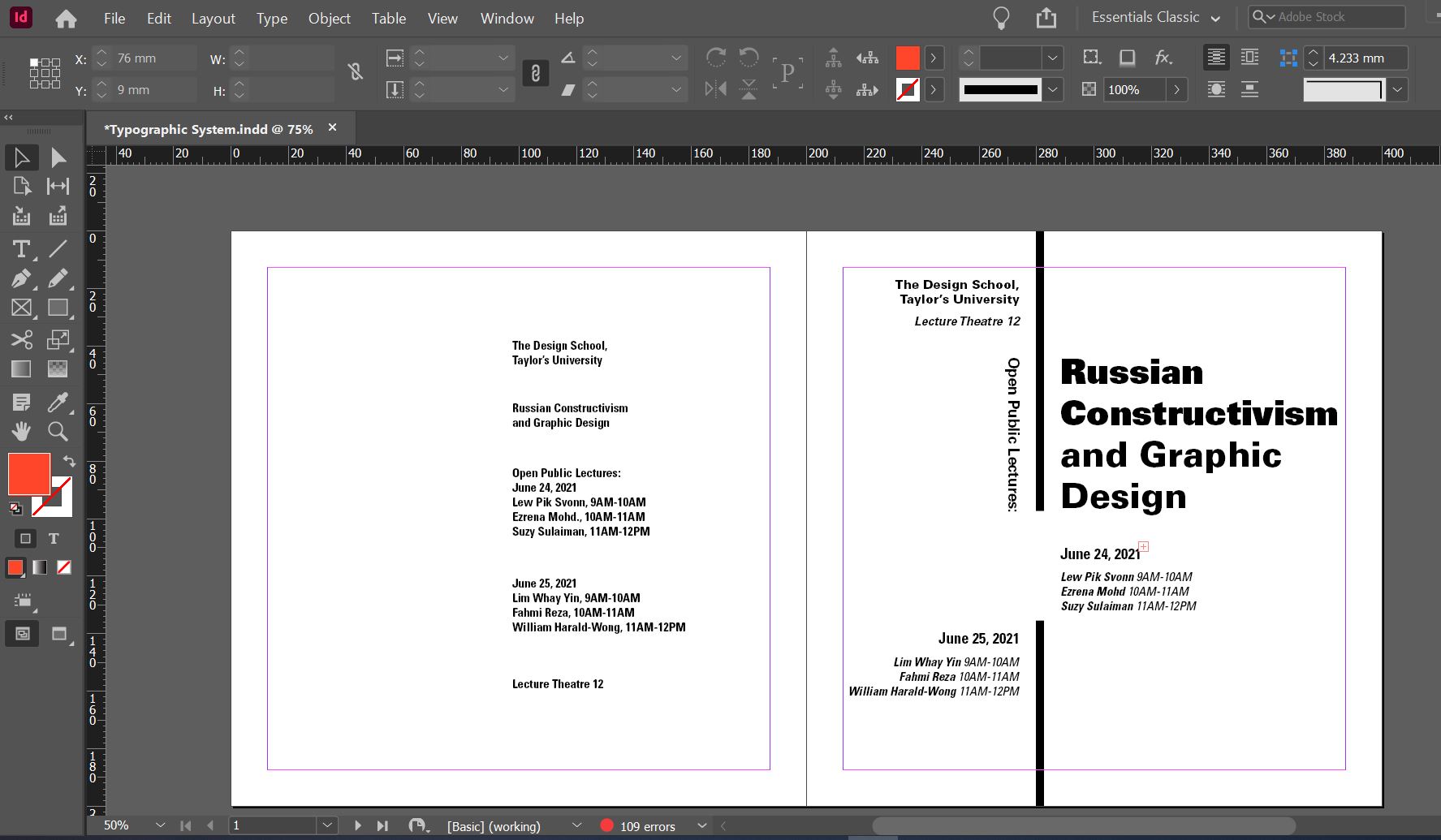
Figure 1.3 Axial system #1 progress, 23rd Aug 2021

Figure 1.4 Axial system #1, 23rd Aug 2021
I try to rearrange the composition of the text to reduce the negative space after receiving feedback from Mr.Vinod. I also introduced a circle to separate the headline and body text. By slanting the axis, the layout became better as it is less stiff compared to the vertical arrangement.


Figure 1.6 Axial system #2 vertical, 23rd Aug 2021

Figure 1.7 Axial system #2 slanted (B&W), 23rd Aug 2021

Figure 1.8 Axial final(RBG),23rd Aug 2021

Figure 1.9 Radial sketches, 23rd Aug 2021

Figure 2.0 Radial system #1, 23rd Aug 2021

Figure 2.1 Radial system #2 progress, 23rd Aug 2021

Figure 2.2 Radial system #2 (white), 23rd Aug 2021
After the feedback session, I took Mr.Vinod advised me to arrange half of the "JUNE 24" content to a larger radius to create more dynamics. Besides, I decided to try out the layout on dark background and I personally find it more interesting as the contrast makes the info pop out.


Figure 2.4 Radial system final (RGB),3rd Sept 2021

Figure 2.5 Dilatational sketches, 24th Aug 2021

Figure 2.6 Dilatational system #1 progress, 24th Aug 2021

Figure 2.7 Dilatational system #1,24th Aug 2021
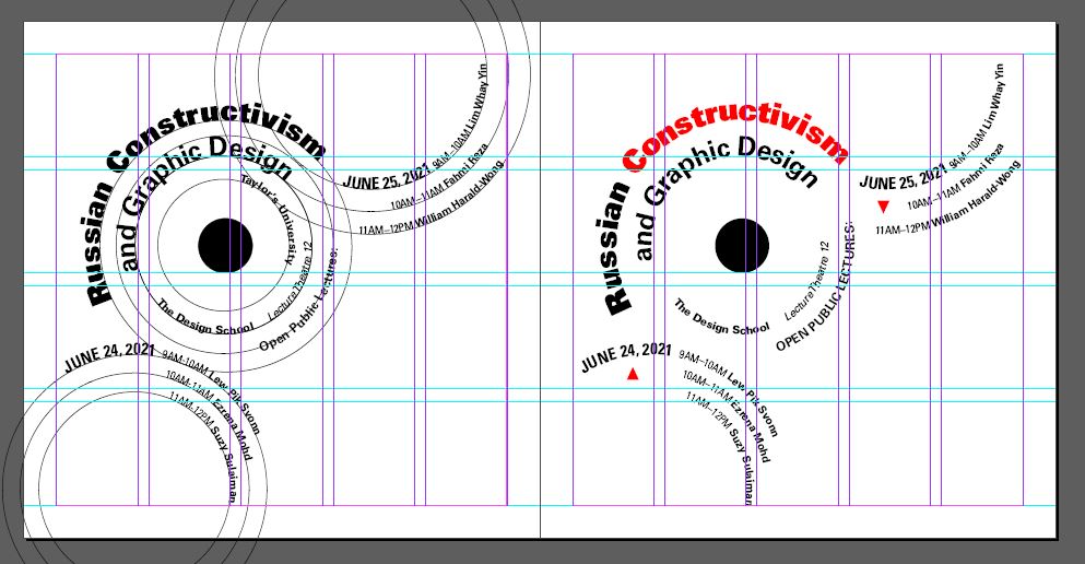
Figure 2.8 Dilatational system #2 grid, 24th Aug 2021
After feedback: the overall layout is good, so I decided to introduce color to it to enhance the info.

Figure 2.9 Dilatational system (B&W), 3rd Sept 2021

Figure 3.0 Dilatational system final (RGB), 3rd Sept 2021
4. Random system ----------------------------------------------------------------------------------------

Figure 3.1 Random system sketches, 24th Aug 2021

Figure 3.2 Random system progress, 24th Aug 2021

Figure 3.3 Random system #1, 24th Aug 2021

Figure 3.4 Random system #2, 24th Aug 2021
After feedback: The random system is considered okay (another type as block random), however can explore more to be 'wilder'. So I break out the letters and try 'play' with different types of font and point sizes to create more dynamic and randomness. I also added some non-objective elements to make it more interesting.

Figure 3.5 Random system #3, 3rd Sept 2021

After having feedback from Mr.Vinod, I decided to "Keep it simple" by removing the black patch and tilted the angle of the random system to create balance.

Figure 3.7 Random system final (B&W), 6th Sept 2021


Figure 3.8 Random system final (RGB), 6th Sept 2021

Figure 3.9 Random system sketches, 24th Aug 2021

Figure 4.0 Grid system progress, 24th Aug 2021

Figure 4.1 Grid system #1, 24th Aug 2021
Feedback: The composition is good, but the alignment for "The Design School" & "Lecture Theatre 12" could be aligned with the Lecture Dates

Figure 4.2 Grid system final (B&W), 3rd Sept 2021

Figure 4.3 Grid system final (RGB), 3rd Sept 2021
6. Transitional system ---------------------------------------------------------------------------------
Figure 4.4 Transitional system sketches, 24th Aug 2021
Figure 4.6 Transitional system #1, 24th Aug 2021
Figure 4.7 Transitional system #2, 24th Aug 2021
Feedback: This slanted transitional layout doesn't really work, so I decided to amend the first idea I have then refine it.
Figure 4.8 Transitional system final (B&W), 3rd Sept 2021

Figure 4.9 Transitional system final (RGB), 3rd Sept 2021

Figure 5.0 Modular system sketches, 24th Aug 2021

Figure 5.1 Modular system progress, 24th Aug 2021

Figure 5.2 Modular system #1, 24th Aug 2021

Figure 5.3 Modular system final (B&W), 3rd Sept 2021

Figure 5.4 Modular system final(RGB), 3rd Sept 2021
8. Bilateral system ----------------------------------------------------------------------------------------
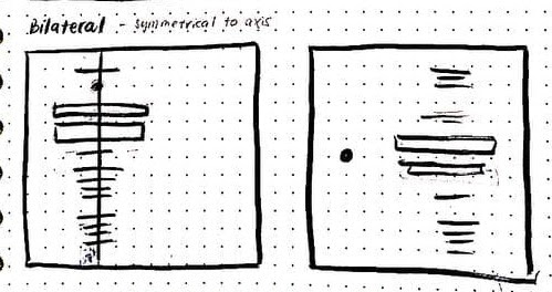
Figure 5.5 Bilateral system sketches, 24th Aug 2021

Figure 5.6 Bilateral system #1, 24th Aug 2021

Figure 5.7 Bilateral system #2 and #3, 24th Aug 2021

Figure 5.8 Bilateral system #3, 24th Aug 2021

Figure 5.9 Bilateral system final(B&W), 3rd Sept 2021

Figure 6.0 Bilateral system final(RGB), 3rd Sept 2021
Final Submission ----------------------------------------------------------------------------------------

Figure 1.0 Final Axial System.jpg, 3rd Sept 2021

Figure 1.1 Final Radial System.jpg, 3rd Sept 2021

Figure 1.2 Final Dilatational System.jpg, 3rd Sept 2021


Figure 1.4 Final Grid System.jpg, 3rd Sept 2021

Figure 1.5 Final Transitional System.jpg, 3rd Sept 2021

Figure 1.6 Final Modular System.jpg, 3rd Sept 2021

Figure 1.7 Final Bilateral System.jpg, 3rd Sept 2021
Figure 1.8 Final Typographic System Submission.pdf, 3rd Sept 2021
Figure 1.9 Final Submission with gridline.pdf, 3rd Sept 2021
Exercise 2 [Part 1]: Type & Play -------------------------------------------------------------
For this task, we are required to search for any man-made objects or natural images, analyze, dissect and identify potential letterforms within the dissected image. After listening to the brief, I decided to go with food we ate daily, with might not notice the fun and detail part of it After searching for few options of French fries or noodles, I decide to go with macaroni with the cute texture and holes.

Figure 1.0 Original source image (Macaroni), 6th Sept 2021

Figure 1.1 Finding type in macaroni, 6th Sept 2021

Figure 1.1 Finding type in macaroni, 6th Sept 2021


Figure 1.2 Extraction and outline of macaroni type, 7th Sept 2021

Figure 1.3 Reference typeface Adobe Caslon Pro (Bold), 7th Sept 2021

Figure 1.4 Process of refining v, 9th Sept 2021

Figure 1.5 Process of refining c, 9th Sept 2021

Figure 1.6 Process of refining c, 9th Sept 2021

Figure 1.7 Process of refining c, 9th Sept 2021
After the feedback session, I decided to minimize the elements to make it look more tidy and standardize. I remain only the circle to maintain hollow characteristic of macaroni.

Figure 1.8 Feedback session, 13th Sept 2021
Design progress -------------------------------------------------------------------------------------------

Figure 1.9 Work in progress, 18th Sept 2021

Figure 2.0 Before and after " v" , 18th Sept 2021

Figure 2.1 Before and after " c" , 18th Sept 2021

Figure 2.2 Before and after " a" , 18th Sept 2021

Figure 2.3 Before and after " p" , 18th Sept 2021

Figure 2.4 Letterform after kerning, 18th Sept 2021

Figure 2.5 Type display with source, 18th Sept 2021
Final Submission ----------------------------------------------------------------------------------------

Figure 1.0 Final "v". jpg, 18th Sept 2021

Figure 1.1 Final "c". jpg, 18th Sept 2021

Figure 1.2 Final "a". jpg, 18th Sept 2021

Figure 1.3 Final "p". jpg, 18th Sept 2021

Figure 1.4 Final Macaroni Type, 18th Sept 2021

Figure 1.5 Macaroni Type Display, 18th Sept 2021
Figure 1.6 Final Macaroni Type.pdf, 18th Sept 2021
Exercise 2 [Part 2]: Type & Image -------------------------------------------------------------
This task is about integrating text with visual to enhance the interplay between the letter/word/sentence and the selected visual. After searching some of the references, I decided to go for food picture as well. I found a nice hamburger photography from Unsplash.


Figure 1.0 References, 13th Sept 2021
Design #1

Figure 1.1 Selected picture from Unsplash, 13th Sept 2021
To begin, I laid some letters in each of the layers of the burger. I decided to express the word "Yummy" with this burger as this is what I thought of when I first look at this picture. The first composition is quite stiff, so I tried to rearrange it and added some texture to the letter. I used a chalk brush to erase the letter little by little to create the flour texture. For the "m" on the bacon, I added some pink stoke to blend the letter in and make the “y" into a shadow on the table.


Figure 1.3 Draft #2 with texture and shadow "y", 14th Sept 2021
I realized there is a potential to add effects on the burger bread. Hence, I hide all previous designs and simply typed " Burger" and wrap them according to the shape. I use the overlay effect to make it blend into the bread texture.

Figure 1.4 Burger bread texture, 14th Sept 2021
I kind of like the burger bread texture effect but I'm not quite sure whether it fulfills the task required or it's too simple? So I continue to try and error to work with the word "yummy", also added a smoke effect behind the object.

Figure 1.5 Draft #4 with smoke background, 16th Sept 2021


Figure 1.6 Draft #5 , 16th Sept 2021
After receiving feedback from Mr.Vinod said that this image is a little too complicated to work on for this task. He advised me to try to integrate the letter with different layers and could have to try a different font. After many attempts, I came out with a new composition with a combination of Upper case and lowercase of the letterforms. To make it more interesting, I added color to blend it with the egg, the coriander, and the sauce. Phewww its a super challenging process but I enjoyed it.

Figure 1.7 Draft #6 , 20th Sept 2021

Figure 1.8 Final Burger Type, 20th Sept 2021
Font used:
Burger bread: Futura bold condense
Burger bread: Futura bold condense
Yummy: ITC Garamond (bold condensed italic, ultra condensed)
Design #2
The burger outcome seems too complicated. So I decided to take a break and search for other simpler images this time. This picture- A girl playing her skateboard in the 'clouds' from Pinterest had gained my attention. I loved the composition and the feel of this photo and I decided to try it out and keep the design simple this time.
The burger outcome seems too complicated. So I decided to take a break and search for other simpler images this time. This picture- A girl playing her skateboard in the 'clouds' from Pinterest had gained my attention. I loved the composition and the feel of this photo and I decided to try it out and keep the design simple this time.

Figure 2.0 Image #2 Girl playing skateboard, 22th Sept 2021

Figure 2.1 Adding letters "BALANCE", 22th Sept 2021

Figure 2.2 Adding gradient effect, 22th Sept 2021
As the scene is cloud and dreamy, I decided to create a gradient effect to make the word look "lighter". Then I realized the original image from Pinterest is a little bit pixelated so I decided to add a little bit of grainy effect for the image but maintaining the brightness of the letters to make them stand out.

Figure 2.3 Adding grainy effect, 22th Sept 2021
The composition seems a little empty, therefore I added tiny words to make it a quote "Find BALANCE in life". I try to hind the word in the cloud and shadow to make them look more natural.


Figure 2.4 Adding gaussian blur effect on "Find", 23th Sept 2021


Figure 2.5 Adding shadow effect "in life", 23th Sept 2021


Figure 2.5 Adding shadow effect "in life", 23th Sept 2021

Figure 2.6 Final design "Find BALANCE in Life", 25th Sept 2021
Font used:
"BALANCE" Futura Std (Heavy)
"Find" "in life"
Effect:
Add vector mask to make a gradient opacity (to create a "light" effect)
Gaussian blur to make the shadow effect
Final Submission ----------------------------------------------------------------------------------------
Figure 3.0 Final Submission Burger Type and Image.jpg, 25th Sept 2021
Figure 3.1 Final Submission Burger Type and Image.pdf, 25th Sept 2021
Figure 3.2 Final Submission Skateboard Type and Image.jpg, 25th Sept 2021
Figure 3.3 Final Submission Skateboard Type and Image,.pdf, 25th Sept 2021
HOURS SPENT:
TASK 1
Exercise 1 Typography Systems- 35 hours (2 weeks)
Exercise 2 [Part 1] Finding Type- 18 hours (1 week +)
Exercise 2 [Part 2] Type and Image - 25 hours (1 week +)
FEEDBACK:
Week 1
General Feedback: Arrange the information according to
visual hierarchy, avoid contrast imbalanced, consistent paragraph
spacing. Try to avoid a 45-degree angle or in the straight middle
division because it may look stiff. Space between the line needs to
be even and check with alignment. Mr. Vinod advised us to put only
0.5 pt / 1pt for the non-objective element.
Specific Feedback: Overall looks okay, the bottom right seems
a lot of negative space, can have better exploration. Could try
slanting the axis, more exciting.
Week 2
General Feedback: For axial, the axis doesn’t have to
be straight but the information. Arrange the information to
balance the empty space. Avoid using too many non-objective
elements, as they distract the visual. Capital number numeral
(reduce 0.5pt). Adjust letter spacing /tracking. We need to
command the space while designing. The random system can be more
complex, take time to explore. Space and movement are important in
a layout.
Specific Feedback: Axial, bilateral, grid system is doing
good. The random system has done well with another type style of
random which is also acceptable. The information the radial system
can place different circles, to make it more dynamic.
Week 3
General Feedback: The sense of art plays a role in the layout to make it aesthetic. Good work achieves both balances in composition and eye-pleasing. Always work in black and white before adding colors. We were encouraged to learn from the famous designers: David Carson, Matthew Carte, and Edward Fella for their artwork. For the new task, do not rush to finish the exercise. Try to explore and refine in separate days to have a fresher mind and better view.
Specific Feedback: The overall typographic systems are fine. The arrangement for random is good. However, the black patches are a bit distracting, which can make it better.
Week 4
General Feedback:
Design exploration is essential, especially in the refining process. The choice of image for letter extraction needs to be accurate to maintain the character of the source or object chosen. We need to develop critical thinking skills by giving feedback to others. We must always ask questions to enhance the learning process.
Specific Feedback:
The letter C is well done. Design exploration is sufficient to retain core features. The curve line for V looks good. The letter a can P descender can decrease a little. The line (macaroni texture) seems to be too complicating, can reduce it into two lines. Work on different types of design, with and without texture.
Week 5
General Feedback:
Study the shadow, and space to play with the letters. The letter needs to interplay with the image. For the selection of photos, the energy and movement of the picture are important. Always try to apply the knowledge we gain evaluate our work based on what we heard. It is okay to make mistakes.
Specific Feedback:
Good attempt on the integration of the image, but it might be a little bit complicated for this task. May try to explore different fonts and play with the different layers of the burger.
Overall feedback: "Good job on the Typo Sys Exercise! Keep it up."
Overall feedback: "Good job on the Typo Sys Exercise! Keep it up."
REFLECTION:
Experience:
The task was interesting to explore. In the beginning, I was lost and did not know where to begin. I urged myself not to rush the exercise and instead spend time listening to the pre-recorded lectures first. After having a rough idea, I browsed through several typographic system websites and ebooks to have a better grasp. After sketching out 2-3 different layouts for each system, I began to digitize them in InDesign. This was the part where I spent a lot of time "trying and error" to get a good composition. The outcome might not be the best but I tried my best in every Typography system by applying the theories. I appreciate Mr.Vinod taking his time to provide us with detailed feedback so that we could know our mistakes and improve them. For the second exercise which is finding type, it was a fun experience to dissect an image. However, I find it challenging at the refining stage as it needs the patience to explore, to amend the detailed parts of the letterform to get a good-looking type that reflects the characteristics of the original object. Part B is exciting but it is hard at the same time when it comes to finding a good image and expressing it creatively with type.
Observations:
For this semester, we have a more number of people in one class and the feedback session took slightly longer than the previous semester. It is great that we are able to meet new classmates and have a more positive learning environment. By learning from one another's work, helps us to enhance our critical thinking skills and prevent making the same mistakes. After I did finding type exercise, I realized there are thousands of possibilities to get inspiration from to develop a type. All we need is to slow down and pay attention to the tiny things around us. Exercise 2B trained us to be "see" out of the box, by exploring the different compositions of typography and applying effects to blend in the image.
Findings:
The exercises appear to be simple, but it is not. We have to pay attention to detail and think creatively to arrange the information according to the visual hierarchy in different typographic systems. and the combination of typefaces requires a careful choice. In addition, color and visual aspects play an important role to highlight the layout. For finding type, I realized studying existing types is always useful before we get into designing a type. Whenever we are stuck in the middle, we can refer back to the structure of reference to guide us to develop further. Lastly, for the type and image exercise, I found that text can be an interesting element to highlight an image, which is pretty cool.
FURTHER READING:

Figure 1.0 Typographic Systems by Kimberly Elam, 26th Aug 2021
A book by Kimberly Elam explores eight major structural
frameworks including radial, axial, modular, transitional
systems, and more. This book provides a variety of good
examples of student and professional work. It helps to
deepen my understanding of each complex arrangement of the
system before stepping into the exercise given. Besides, I
find it very useful to look at the example of design
development from the initial phrase, intermediate phrase to
advanced.

Figure 1.1 Type 365 eBook by Lucas Czarnecki, 4th Sept 2021
In this ebook, I have learned the suggested flow of
designing each typographic system. They are some awesome
references displayed to give me more idea on designing.
Utilizing the grid lines, margins, and shapes, we could
explore many different compositions in a particular system.
In addition, the article also describes how non-objective
elements and the introduction of color will help to create
an emphasis and balance.

Figure 1.2 A Pocket Guide to Combining Typefaces by Tim Brown, 2nd Sept 2021
I love one of the quotes from this book "By trying, we grow knowledgeable; and by having tried, we grow wise." After reading a few chapters, I realized the importance of applying different typefaces in a design. It might be challenging to choose and decide the right typography with matches together. This process needs a lot of practice, hard work, and exploration in order to get a successful composition. Tips to know a typeface: research its designer, anatomy, family, classification, and the job it can be done the best.


Comments
Post a Comment