ADVANCED TYPOGRAPHY// LECTURE NOTES

23.08.2021 -15.11.2021 (Week 1-Week 13)
Chaw Zhi Ting (0347344)
Bachelor of Design (Hons) Creative Media
Advanced Typography // Lecturer Notes
LECTURES COMPILATION:
AdvTypo_0
Mr Vinod briefed us the new module and introduced us the brand new learning style
As we can see from the module name itself is ' Advanced Typography', this semester we are not encouraged to rely on the lectures feedbacks, instead, be independent learning with peers in a group and present the topic ideas to the target audience
5 slides - written content
1-2 images on slides (visual)
3 major question: opinion/
Typographic Systems
"All design is based on a structural system" -Elam
Elements are dependent on communication in order to function (hierarchy, reading order, legibility and contrast)

Figure 1.0 Typography system (source), 23rd Aug 2021
1. Axial - all elements are organized to left or right of single-axis
Example: the trunk of tree, flower stems (can be horizontal/vertical/ diagonal/shaped axis)

Figure 1.1 Example of axial system by Odermatt &Tissi (1980), 23rd Aug 2021

Figure 1.2 Example of axial system by Jeremy Borthwick, 23rd Aug 2021
2. Radial : all elements are extended from a point of focus
Example: sun, flower petals, fireworks, starfish (top to bottom/ bottom to top/right side up/upside down )
Example: sun, flower petals, fireworks, starfish (top to bottom/ bottom to top/right side up/upside down )

Figure 1.3 Radial system by Paula Scher (1996),23rd Aug 2021
3. Dilatational: expand in regular or rhythmical increment from the centre point
Example: waves created when a pebble dropped into still water (can be a few-layer, depends on hierarchy)

Figure 1.4 Example of dilatational system by Stein and Ott(1984),23rd Aug 2021
4. Random: arrangement without specific pattern, rule or relationship
Example: cropping, overlapping, placing odd angles

Figure 1.5 Example of random system by David Carson ,23rd Aug 2021
5. Grid: vertical and horizontal divisions
Examples: window, crossword, puzzle (manuscript grid, column, modular, hierarchical grid)

Figure 1.6 Example of grid system by Josef Muller Brockmann (1950),23rd Aug 2021
6. Transitional: informal system with shifted bands and layers
Examples: casually stacked wood (move freely left and right)
Figure 1.7 Example of transitional system by David Carson (1996),23rd Aug 2021
7. Modular: A series of non objective elements that are constructed in as a standardized units (move it around with 2 base units)
Examples: building blocks, storage containers, component systems ( square, circles, ellipse, triangles)

Figure 1.8 Example of modular system by Mike Plymale ,23rd Aug 2021
8. Bilateral: All text is arrange symmetrically on a single axis
Examples: butterfly, leaves (can be 2 bilateral axis)

Figure 1.9 Example of bilateral system by Odermatt &Tissi(1992),23rd Aug 2021
"Each system have it's own strength and restriction, so it needs to be use wisely depends on the content."
AdvTypo_Ex (Tutorial)

Figure 2.0 Axial tutorial,25th Aug 2021
Mr.Vinod demonstrated how to start the exercise by adding columns and gridline, pasting the information given then arrange the text one by one.
Revision/ Tips:
Shift + enter (to follow the leading)
Unit & Increment (change kerning/tracking to 5mm)
*Before changing to small capitals (needs to be lover case
*En dash (Ctrl +- ) : a long dash for time
*Gutter (spaces between 2 column = column intervals)

Figure 2.0 Axial tutorial,25th Aug 2021

Figure 2.1 Modular tutorial,25th Aug 2021


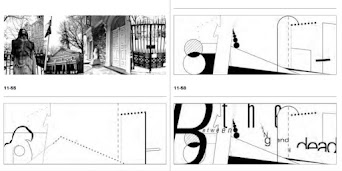
Figure 1.9 Example of environmental grid,1st Sept 2021

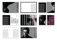


Figure 2.1 Example of "What we do in Shadows",6th Sept 2021

Figure 2.2 Evolution of the Alphabet,13th Sept 2021


Figure 2.5 Early Greek,5th C.B.C.E.
Figure 2.6 Roman Uncials,4th C.English Half Uncials

Figure 2.7 English Half Uncials,8th C.
Figure 2.8 Carolingian Minuscule
Black Letter
Figure 2.9 Black letter,12-15 C. CE

Figure 3.0 The Italian Renaissance
Figure 3.1 Movable Type, 11 C.—14 C.


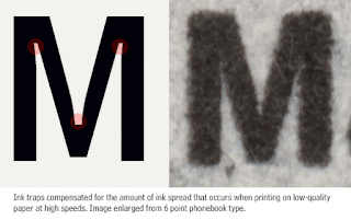
Figure 1.2 Bell Centennial, 20th Sept 2021

Figure 1.3 Underground, 20th Sept 2021


Figure 1.5 Classification of letter and form, 20th Sept 2021
 Figure 1.6 Revised by Rudi Ruegg


Figure 1.9 Example for weight, 5th October 2021

 Figure 2.1 Example for structure, 5th October 2021
 Figure 2.2 Example for texture, 5th October 2021

Figure 2.3 Example for direction, 5th October 2021

Figure 2.4 Example for colour, 5th October 2021


Ad Typo_2
Principle of design composition: Emphasis, isolation, symmetry and asymmetry, alignment is easier to achieve when in typographic layouts, For notions like repetition and perspective which is less conducive when it is translated.
Rule of thirds: A frame can be divided into 3 columns and 3 rows, the intersecting point will be the important text.
Grid system, also known as Raster System is the most used typographic system derived from the grid compositional structure of Letter Press printing. It may seem old and rigid but the modular nature allows designs to be adaptable.
Post-modernist: randomness, asymmetry and chaos


Figure 1.8 Artwork from Paula Scher(left) and David Carson (right), 1st Sept 2021
Environmental Grid: exploration of an existing structure or numerous structure combined. Designer utilized the crucial lines both curved and straight to organize the information in a unique and exciting way.

Figure 1.9 Example of environmental grid,1st Sept 2021
Form and movement: encourage exploration from existing grid system to dispel the seriousness. Care need to be taken to ensure visual connections and surprises. When new elements such a images and colour or text are added, the level of complexity increases.


Figure 2.0 Example of form and movement,1st Sept 2021
Use of extraction type in movie poster:


Figure 2.1 Example of "What we do in Shadows",6th Sept 2021
Ad Typo_3 Context & Creativity
This lecture explained how handwriting back then influenced typography today. Then Mr.Vinod walked us through the historical evolution of the Latin Alphabet which starts from cuneiform, hieroglyphics, and so on. For decades, Asia/East has neglected its written heritage. It is tough to create the old text in printed form by adapting western printing technologies such as letterpress, linotype, Unicode). However, with a mild renaissance in the East, with the advent of computer programmers in large numbers, now we could see the indigenous scripts on electronic devices.
Handwriting
1. First mechanically produced letterforms, becoming the basis of standard for form, spacing and conventions
2. Shape and line of hand-drawn letterforms are influenced by tools (plant stem, sticks, sharpened bones and material ( clay , papyrus, animal skin etc.)

Figure 2.2 Evolution of the Alphabet,13th Sept 2021
Cuneiform
Earliest system of actual writing (involved from pictograms, written from left to right)
Earliest system of actual writing (involved from pictograms, written from left to right)

Figure 2.3 Cuneiform,3000 B.C.E.
Hieroglyphics
The Egyptian writing system is fused with the art of relief carving. This system was a mixture of both rebus and phonetic characters.
The Egyptian writing system is fused with the art of relief carving. This system was a mixture of both rebus and phonetic characters.

Figure 2.4 Hieroglyphics,2613–2160 B.C.E.
Can be use in 3 different ways:
i. As ideogram (represent things they actually depict)
ii. As determinatives (the signs preceding are meant as phonograms and indicate the general idea of word)
iii. As phonograms (represent sounds of individual words)
Early Greek
-Built on the Egyptian logo-consonantal system
-Built on the Egyptian logo-consonantal system
-Phoenicians develop 22 letters then the Greeks added necessary vowels.
-The words may have been in rows but the direction of reading was not yet fixed
-Greek was often read in a format known as boustrophedon or “as the ox plows.” One row would read left to right and then switch from right to left.

Figure 2.5 Early Greek,5th C.B.C.E.
Roman Uncials
Roman letters becoming more rounded, curved for less strokes (can write faster)

Figure 2.6 Roman Uncials,4th C.
Evolved to more slanted and condensed form

Figure 2.7 English Half Uncials,8th C.
Carolingian Minuscule
During Charlemagne's patronage book production, language was standardized : pronunciation, spelling, writing conventions (capitals, spaces between words and punctuation).

Figure 2.8 Carolingian Minuscule
Gothic was the culminating artistic expression of the middle ages, and the spirit took hold in France, Germany and England where it was manifested through unhindered upward striving. They preferred evenly spaced vertical dominant lines, pointed arches, an almond shape. Blackletter is characterized by tight spacing and condensed lettering.

Figure 2.9 Black letter,12-15 C. CE
The Italian Renaissance
Humanist scholars in Italy were slowly reviving the culture of antiquity. They admired the Carolingian script, which had clear open handwriting and rediscovered letterforms name Antica. The renaissance analysis of form form the art and architecture was directed toward letterform, resulting in a more perfect or rationalized letter.

Figure 3.0 The Italian Renaissance
Movable Type
This innovation was pioneered in China but achieved in Korea (Diamond Sutra).
In the late 1300-1399 CE, several decades before the earliest printing in Europe (Guttenberg’s bible 1439), the Koreans establish a foundry to cast movable type in bronze.

Figure 3.1 Movable Type, 11 C.—14 C.
AdTypo 4_Designing Type
Xavier Dupré (2007) in the introduction of his typeface Malaga suggested two reasons for designing a typeface:
• type design carries a social responsibility so one must continue to improve its legibility.
• type design is a form of artistic expression.
Frutiger
sans serif typeface designed by the Swiss type designer Adrian Frutiger in 1968
Purpose: To create a clean and highly legible at a distance or at small text sizes, specifically for the newly built Charles de Gaulle International Airport in France.
Considerations/Limitations: letterforms need to be recognized (even in poor light conditions/ when the reader was moving quickly past the sign)
Figure 1.0 Frutiger, 20th Sept 2021
Verdana
Designed by Matthew Carter in 1996, son of Harry Carter — the Royal Designer for Industry, contemporary British type designer & ultimate craftsman.
Purpose: the font was tuned to be extremely legible even at very small sizes on the screen (internet and electronic devices)
Considerations/limitations: The Verdana fonts exhibit characteristics derived from the pixel rather than the pen, the brush or the chisel. Letterlike lowercase "i j l" were commonly confused.
Figure 1.1 Verdana, 20th Sept 2021
Bell Centennial
Design by Matter carter
Purpose: Create a typeface that maintains readability in small sizes (telephone directories)
Consideration/limitations: Printing on cheap absorbent paper and when printing is fast and not very precise. Corners generally tend to suffer from ink traps the corners remain visible
Figure 1.2 Bell Centennial, 20th Sept 2021
Underground Sans/ Johnston Sans
Edward Johnston
Purpose: Create a typeface with "bold simplicity" for London's Underground railway that is used in posters and signage.
Considerations/limitations: Johnston wanted to unite the London Underground Group — the different companies using the same rails & tunnels but, all the signage was all completely different. He applied the proportions of Roman capitals to his typeface, combining traditional calligraphy with elegance & simplicity.
Figure 1.3 Underground, 20th Sept 2021
Process of Type Design
1.Research: In this stage, it's important to understand type history, type anatomy and type conventions. We should also know terminologies, side-bearing, metrics and identify the type's purpose. Besides, study existing font for inspiration/reference/context/study the pattern is essential.
2.Sketching: traditional tool(brushes, pens, ink & paper) or digital toolsets (Wacom) which is quicker
3. Digitization: professional software (Fontlab, Glyphs App). We should give attention to the whole form and counter form in order to make sure the readability and legibility.
4. Testing: an important step to refine and correcting aspects of the typeface (display type/text type)
5. Deploy: Some issues not seen during prototyping may need revisions at this stage.
Typeface Construction:
Roman Capital: The grid consists of a square and inside it is a circle that just touches the lines of the square in four places. Thus, using grids (with circular forms) can facilitate the construction of letterforms and is a possible method to build/create/design your letterform.
Figure 1.4 Roman Capital, 20th Sept 2021
Construction & Consideration
Visual correction is needed on the extrusion of curved (and protruding) forms past the baseline and cap line, vertical alignment between curved and straight forms and distance between letters. The letters must be altered to a uniform ‘visual’ white space, which is known as ‘fitting’ the type.
Figure 1.5 Classification of letter and form, 20th Sept 2021
Ad_Typo 5
Perception in Typography: Visual navigation and interpretation via contrast, form, and organization of the content (textual, visual, graphical, or color)
Figure 1.7 Theory by Carl Dair (principles, texture & direction)
1. Size: draw the attention of the reader, we often see the big letter first before the small, usually a bigger size is used in the headline and title.
Figure 1.8 Example for size, 5th October 2021
2. Weight: we can make the type stand out by bolding it, and utilizing the rules spots and squares.
Figure 1.9 Example for weight, 5th October 2021
3. Form: the distinction between capital letters, lowercase equivalent, and expanded versions of the typeface
Figure 2.0 Example for form, 5th October 2021
4. Structure: the combination of different letterforms and kinds of typeface (exp: sans serif and serif, italic and blackletter
5. Texture: applying size, weight, form, and structure to a block of text. Texture refers to the way lines of type look as a whole up close and from distance.
6. Direction: opposition of vertical and horizontal and different degrees of angles.
Figure 2.3 Example for direction, 5th October 2021
7. Colour: the second color is less emphatic values than plain black and white.
Figure 2.4 Example for colour, 5th October 2021
Form:
- Overall look and feel of elements that make up the typographic compositions, (writing) - to represent a concept in visual form. Balanced harmony of function and expression is created when the meaning and form interplay well. A typeface is perceived as a form when it is manipulated by distortion, texture, enlargement, and extruded into a space.
Figure 2.5 Example for form, 5th October 2021
Organisation/ Gestalt:
- Emphasize the whole is greater than the part. The components/ elements that make up the design are only as good as its overall visual form. While each component may be functional at an elemental level, the sum of its parts is not greater than the whole or the overall form.
Figure 2.6 Gestalt Principles, 5th October 2021
Law of Similarity:
- Gestalt grouping law states that elements that are similar to each other tend to be perceived as a unified group. Similarity can refer to any number of features, including color, orientation, size, or indeed motion.
Law of Proximity:
- Gestalt grouping law "elements that are close together tend to be perceived as a unified group". Items close to each other tend to be grouped together and vice versa
Law of Closure:
- Refers to the mind’s tendency to see complete figures or forms even if a picture is incomplete, partially hidden by other objects, or if part of the information needed to make a complete picture in our minds is missing.
Law of (Good):
-The alignment of the objects or forms plays a major role in this principle as humans tend to perceive each of two or more objects as different, singular, and uninterrupted objects even when they intersect.
Law of Symmetry/ Pregranz:
- Organization of the information in the form of laying out complex content in a hierarchical manner requires practice and the knowledge gained herein but also elsewhere.
QUICK LINKS :


Comments
Post a Comment