ILLUSTRATION & VISUAL NARATIVE // PROJECT 1

Chaw Zhi Ting (0347344)
Bachelor of Design (Hons) Creative Media
Illustration & Visual Narrative // Project 1
LECTURES :
Week 1/ Introduction & Briefing
A warm welcome by Ms. Noranis and Mr. Kannan to new semester students. After done a short introduction, they briefed us on the exercises and projects that we have to be done throughout the semester such as character design, poster, animated GIFs and motion comic. It was pretty new to me because I had never try designing my brand new character and comics. It would be an exciting and challenging journey and I'm looking forward to it.
Week 2/ Character Design Figure 1.2 Favourite cartoon character shared by students on Padlet, 8th April 2021
 Figure 1.3 Lecture slides on basic shapes of characters, 8th April 2021

Figure 1.4 Lecture slides on color study, 8th April 2021
Week 3/ Visual Techniques
Figure 2.0 Lecture slides on composition, lighting and contrast, 15th April 2021

Figure 2.1 Types of shots/compositions, 15th April 2021

 Figure 3.0 Example one point view and visual hierarchy, 22th April 2021

Figure 3.1 Example of layers creating depth and parallax effect, 22tnd April 2021

Figure 3.2 Class exercise, 22nd April 2021
Week 2/ Character Design
In this week tutorial, we learned about the formation of character using basic shapes. Before that, each of the students shared their favourite character on Padlet. My favourite cartoon will be Baymax in Big Hero 6 which is an adorable character. In terms of personality, Baymax is rather calm and caring towards human emotions. Using these examples we have shared, Ms. Norani explained the theory of the characters and what makes them a good design. I like this interaction activity as we are able to understand more about the design principles.

Firstly, shapes are the key of design a character to create an iconic look or design. Using the character from the Disney movie " Aladdin", Ms Noranis explained deeper about the specific shape given to each character and how they reflect their identity. For instant, Aladdin was given a more stable shape to reflect his reliable character whereas Genie with the inverted droplets gives a mysterious character. Besides, we also learn about creating harmony by understanding the colour wheels which are complementary, analogous, split, triadic and rectangle.


Figure 1.4 Lecture slides on color study, 8th April 2021
Week 3/ Visual Techniques
In this live class, Ms. Anis started with a question : why do some visuals in Instagram look so iconic and outstanding? The answer combination of good Composition and design principles. More specifically, things like contrast, hierarchy, balance created by the placement of design subjects.

Figure 2.0 Lecture slides on composition, lighting and contrast, 15th April 2021

Figure 2.1 Types of shots/compositions, 15th April 2021
A balance distributes of positive & negatives
Positive refers to the brighter parts in a composition and negative refers to the dark parts. Besides, if a composition works in greyscale, then it will most likely work wherever. Mainly focuses on the visual hierarchy that tells the story the best.

Figure 2.2 Positive and negative of in a scene, 15th April 2021
Next we learned the importance sense of the space when composing a scene. With the use of techniques such as illustrating elements of foreground (close to the viewer), midground, and background (most far away), it gives a sense of scale to the viewer. The subject matter is often in the foreground or midground, while the world setting is often in the background of the setting the subject matter is inhabiting.


Figure 2.2 Positive and negative of in a scene, 15th April 2021

Figure 2.3 Lecture notes of different type of background, 15th April 2021

Figure 2.4 Quick analysis of a scene, 15th April 2021
 Figure 2.4 Class exercise, 15th April 2021
Week 4/ Compositions & Perspectives
Today the class started with explaining the theory of composition and perspectives based on the painting before the 14th century, "The Last Supper" by Da Vinci. We learned about the importance of perspectives which can be used to create a sense of depth in illustrations. To apply the theory we have learned, Ms.Anis let us sketch out 1 point, 2 point and 3 points in 30 mins time as shown (Figure 3.2). This exercise was fun yet challenging which I think I need more practice.


Figure 3.1 Example of layers creating depth and parallax effect, 22tnd April 2021

Figure 3.2 Class exercise, 22nd April 2021
INSTRUCTIONS:
PRACTICAL:
Week 2/ Chiaroscuro
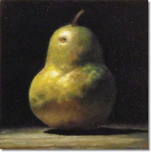

Figure 3.1 Chiaroscuro practices, 8th April 2021
Week 2/ Chiaroscuro
This week we practiced the Bezier game and learned about basic tools of Adobe Illustrator. The techniques we have learnt including creating shapes, changing the colour gradient and different type of strokes. Besides we learned about Chiaroscuro which aims to study the contrast of light and shadow. To deepen the understanding, we were given a pear as our case study and experimental exercise. It all started by using a pen tool to create a simple shape of the pear. Then with the knife tool, it separated the light and shadow part. By changing the shadow part to a darker tone, the flat design immediately looks more solid and realistic. I enjoyed doing this exercise as the process of slicing the pear reminds me of the Fruit Ninja game.

Figure 3.0 Original pear image provided, 8th April 2021

Figure 3.1 Chiaroscuro practices, 8th April 2021
Week 3/ Applying texture, Creating pattern and Swatches in Illustrator
Figure 3.2 Clipping mask, blending and applying texture practices, 15th April 2021
Figure 3.3 Creating swatches and patterns using shapes, 15th April 2021

Figure 4.0 Creating scene with foreground, midground and background, 22nd April 2021

Figure 4.1 Added mesh to change the tone, 22nd April 2021

Figure 3.2 Clipping mask, blending and applying texture practices, 15th April 2021

Figure 3.3 Creating swatches and patterns using shapes, 15th April 2021
Week 4/ Creating a scene using Illustrator
Mr.Kannan thought us how to create shadows, gradient, mesh tool and other interesting tool in Illustrator. These techniques and tools are very useful for us to create out own character and background.

Figure 4.0 Creating scene with foreground, midground and background, 22nd April 2021


Figure 4.1 Added mesh to change the tone, 22nd April 2021
Assignment Brief//Exercise 1 - Vormator Challange
TASK 1: VORMATOR CHALLENGE
For this task, we were required to create our own character creatively using 8 of the shapes given which also known as the "Elements". This task was fun yet challenging as we are not allowed to distort or cut the shapes but we are allowed to change suitable size and rotate the shapes. We were required to start rough sketches to explore more possibilities of the character design then use Adobe Illustrator to create the final design.

Figure 1.0 Template of vormator shapes, 1st April 2021

Figure 1.1 Draft sketches of the character, 8th April 2021

Figure 1.2 Exploration on character eyes design, 9th April 2021
I enjoy exploring using the shape provided to create different possibilities. After having feedbacks from Ms. Anis from my first sketch which is too simple and common. I search for more inspiration through Pinterest, Dribble and started to look for inspiration from things around me. When I opened my fridge, I saw carrot and radish which are my favourite vegetables. Then I started to think why don't I come out a 'Vege monster where it is a combination of carrot and radish. From there, I started to develop my character and sketched the other ideas I have in mind (Figure 2.3).

After I got a rough idea, I started to digitalize the character using the shapes provided. Parts by parts, I have finally done creating 'Radarot'. As I want my character to be cheerful, friendly and energetic. Therefore, the choice of colour is vibrant to make the character more approachable. What special about 'Radarot' is she able to feel people's emotion and will try her best to make you happy!


Figure 1.4 First character design 'Radarot', 11th April 2021


After completing the component of the character, I started to add on the details and effects to it. I explored different gradient to make it look more interesting.


Figure 1.8 Final character design, 20th April 2021
Final Submission for Exercise 1, 2nd May 2021
Assignment Brief//Exercise 2a - Vector Landscape Illustration
Exercise 2a - Vector Landscape Illustration
Before starting designing the landscape for 'Aloha', I searched for references to seek inspiration. Then from these pictures, I made a colour palette to help me with the design.

Before starting designing the landscape for 'Aloha', I searched for references to seek inspiration. Then from these pictures, I made a colour palette to help me with the design.

Figure 2.0 References and ideal colour palatte, 22nd April 2021


Figure 2.2 Exploring of shadow and layout, 23rd April 2021
After having feedback from Ms.Anis, the first landscape design it's too similar to the character. It does not pop out, so I decided to change the colour tone. Besides, I think the trees were lacking details and movement. Hence I try to replace it with coconut trees (Figure 2.5) which gives more Hawaii feel. Then I apply gradient effect and texture on the landscape to spice things up.

Figure 2.3 Progress on designing landscape, 27th April 2021

Figure 2.4 Final of first landscape design, 27th April 2021


Figure 2.6 Final landscape design, 27th April 2021
Final Submission for Exercise 2a, 2nd May 2021
Exercise 2b- Game Play Card Composite
Within the references I found, I picked up the interesting element I wanted to include in my game card design. For example, the flora element, the diamond and gothic frame.


Figure 3.0 Card design references, 27th April 2021

Figure 3.1 Game card sketches, 29th April 2021
Within the references I found, I picked up the interesting element I wanted to include in my game card design. For example, the flora element, the diamond and gothic frame.


Figure 3.0 Card design references, 27th April 2021

Figure 3.1 Game card sketches, 29th April 2021

Figure 3.2 Card elements design for 'Aloha', 29th April 2021


Figure 3.4 Second 'Aloha' game card design, 29th April 2021
Final Submission for Exercise 2b, 2nd May 2021
FEEDBACKS:
- Idea sketches (Figure 2.1) need more exploration more on the design. The concept of "gentle monster" is good, may further develop.
- The idea for the mood bar is great but the design looks stiff, can be improvised.
- Ms.Anis commented my progress for background and card design (Figure 2.6) can have more contrast colour to make the character stands out. Next can try to apply texture on the mountains and the card.
- I come out with two background designs and I received some feedback from my peers and sisters. They commented the overall design looks nice and will prefer the 2nd background design (Figure 2.5) as it gives a more Hawaii feel.
REFLECTION:
Throughout these exercises, I had a lot of fun completing each task for this project. I learned the tricks and tools from Adobe Illustrator which is wonderful. At the beginning of the process, I was struggling to create something with the limited shapes given when designing our character. It took time to explore and develop the sketches. It was great to apply the knowledge I learned from the lecture and tutorial by Miss. Anis and Mr. Kannan. I had a better insight into the character and illustration design. In terms of the design itself, I personally love 'Aloha' as it was something I created from scratch. She is a friendly and adorable character who dance all your stresses away! I am excited to learn more and explore the next exercise!


Comments
Post a Comment