TYPOGRAPHY// TASK 3(B)
08.06.2021 - 22.06.2021 (Week 11 - Week 13)
Chaw Zhi Ting (0347344)
Bachelor of Design (Hons) Creative Media
Typography // Task 3(B)
LECTURE:
Sticker pack tips:1. Telegram stickers must be PNG files with a transparent background.2. Telegram stickers cannot be larger than 512 x 512 pixels.3. Telegram stickers cannot contain copyrighted material (such as images or quotes from popular media).
Figure 1.0 Typography stickers demo by Mr.Vinod, 8th June 2021
How to add and use your sticker pack in Telegram:1. Open the Telegram app and log in if prompted.2. Tap on the search bar and type "stickers," then tap on the Telegram sticker bot once it appears. This will create a new conversation with the sticker bot; tap "Start" to begin.3. Type "/newpack" (without quotation marks) into the message bar and tap the blue arrow to send the message.4. Type a name for your sticker pack in the message bar and tap the blue arrow.5. Now it's time to upload your first sticker. Tap on the paperclip icon in the message bar, then tap "File," and then select the sticker you want to upload.

Figure 1.0 Typography stickers demo by Mr.Vinod, 8th June 2021
INSTRUCTIONS:
TASK 3(B): TYPE DESIGN & COMMUNICATION //TELEGRAM STICKER
 Figure 1.0 Reference of typography stickers, 8th June 2021

Figure 1.0 Reference of typography stickers, 8th June 2021
1. RESEARCH:
MEANING OF MID AUTUMN//- Gathering - family or friends reunion at this festive
- Thanksgiving for the harvest
- Moon is at its brightest and fullest size, coinciding with harvest time in the middle of Autumn
- Lanterns of all size and shapes, are carried and displayed – symbolic beacons that light people's path to prosperity and good fortune.
- Mooncakes, a rich pastry typically filled with sweet-bean or lotus-seed paste


Figure 1.1 Reference of paper lantern and mooncake, 8th June 2021

Figure 1.2 Reference of Mid Autumn Festival Poster, 8th June 2021
MEANING OF MID AUTUMN//
- Gathering - family or friends reunion at this festive
- Thanksgiving for the harvest
- Moon is at its brightest and fullest size, coinciding with harvest time in the middle of Autumn
- Lanterns of all size and shapes, are carried and displayed – symbolic beacons that light people's path to prosperity and good fortune.
- Mooncakes, a rich pastry typically filled with sweet-bean or lotus-seed paste


Figure 1.1 Reference of paper lantern and mooncake, 8th June 2021

Figure 1.2 Reference of Mid Autumn Festival Poster, 8th June 2021
2. DESIGN PROCESS:
By studying the references, I started to brainstorm and sketched my ideas on paper. Then, tried to digitize using the 10 typefaces given.
Figure 1.3 Sketches of Mid Autumn sticker, 8th June 2021

Figure 1.4 First daft for digitization , 8th June 2021
By studying the references, I started to brainstorm and sketched my ideas on paper. Then, tried to digitize using the 10 typefaces given.
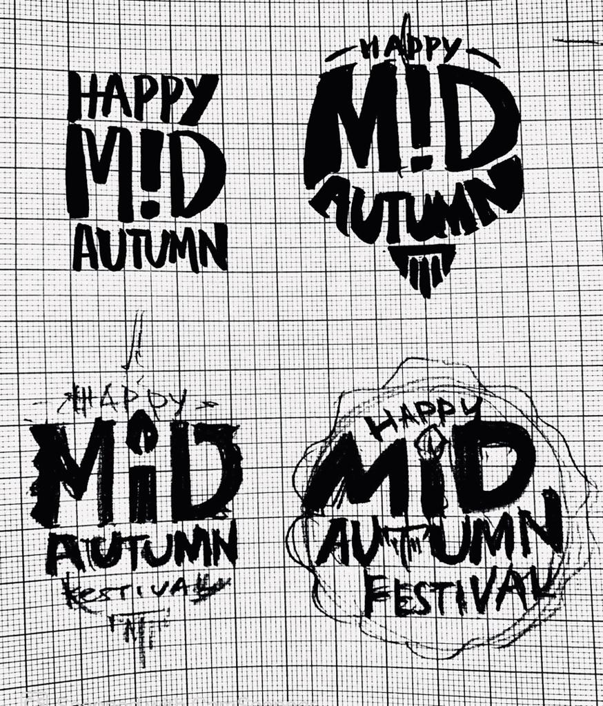
Figure 1.3 Sketches of Mid Autumn sticker, 8th June 2021

Figure 1.4 First daft for digitization , 8th June 2021
3. DESIGN 1// THE LANTERN
After having feedbacks, I further developed my design from the first draft. Choosing the one with minimal letter distortion, I then started to create the background to cover the 'empty spaces'. With the help of the gridlines, I created a paper lantern silhouette with pen tool then curve the shape edges.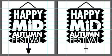 Figure 1.5 Creating lantern silhouette as the sticker background, 8th June 2021

Figure 1.6 Process of adding gradient, 8th June 2021

Figure 1.7 Studying the colour palette, 8th June 2021

 Figure 1.8 Adding more interesting element in the design, 9th June 2021
 Figure 1.9 Comparison of lantern design sticker (before and after), 9th June 2021


Figure 2.0 Final lantern sticker B&W version, 15th June 2021

Figure 2.1 Final lantern sticker coloured version, 15th June 2021
Figure 2.2 Final lantern sticker pdf version, 15th June 2021
After having feedbacks, I further developed my design from the first draft. Choosing the one with minimal letter distortion, I then started to create the background to cover the 'empty spaces'. With the help of the gridlines, I created a paper lantern silhouette with pen tool then curve the shape edges.

Figure 1.5 Creating lantern silhouette as the sticker background, 8th June 2021
Figure 1.6 Process of adding gradient, 8th June 2021
Figure 1.7 Studying the colour palette, 8th June 2021

Figure 1.6 Process of adding gradient, 8th June 2021

Figure 1.7 Studying the colour palette, 8th June 2021


Figure 1.8 Adding more interesting element in the design, 9th June 2021

Figure 1.9 Comparison of lantern design sticker (before and after), 9th June 2021
Figure 2.0 Final lantern sticker B&W version, 15th June 2021

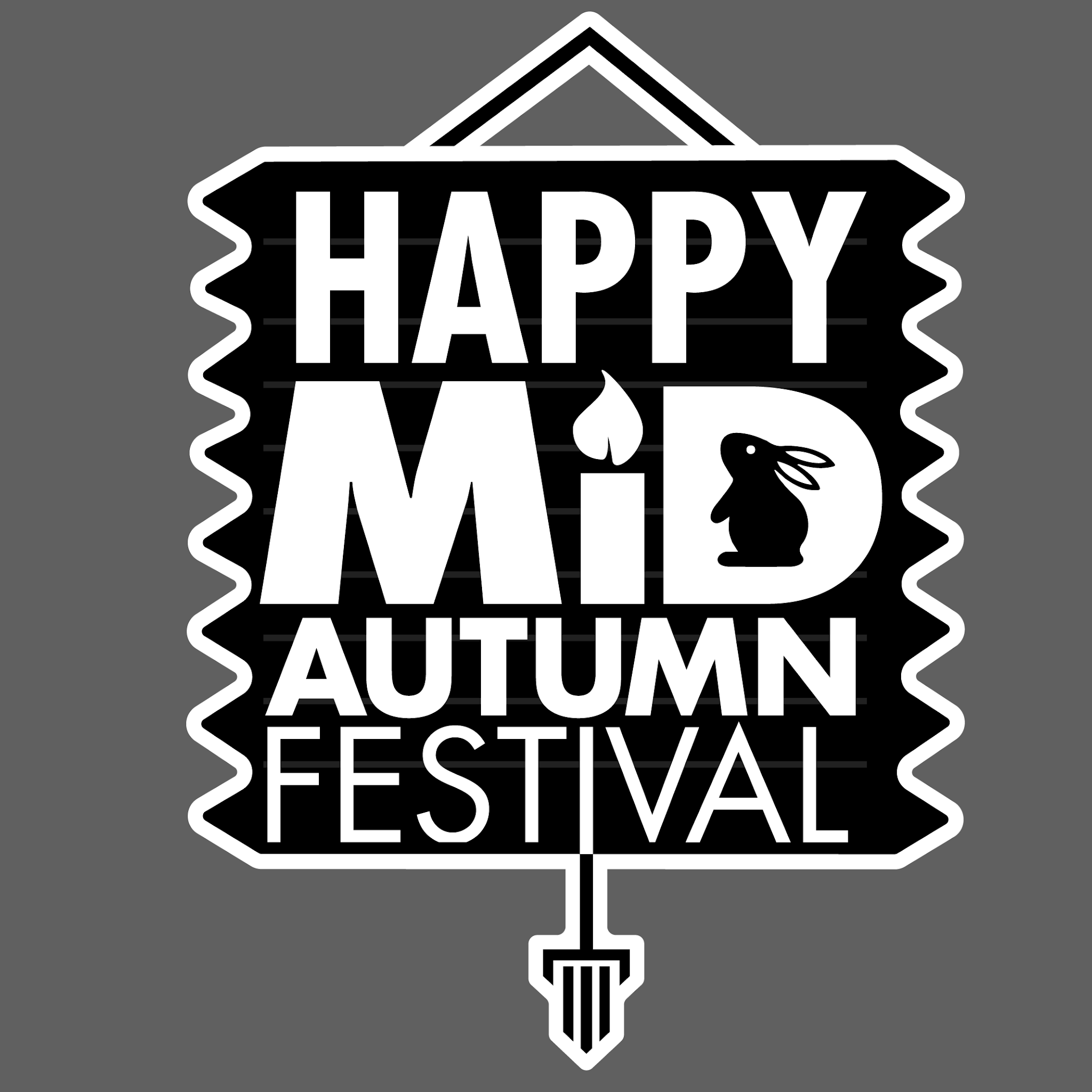
Figure 2.0 Final lantern sticker B&W version, 15th June 2021


Figure 2.1 Final lantern sticker coloured version, 15th June 2021
Figure 2.2 Final lantern sticker pdf version, 15th June 2021
4. DESIGN 2// THE MOONCAKE
 Figure 2.3 Sketch for mooncake sticker, 8th June 2021

Figure 2.4 First attempt of digitizing for mooncake sticker, 9th June 2021

Figure 2.5 Design of the mooncake shape with brackets, 9th June 2021


Figure 2.6 First design of mooncake stickers,9th June 2021
By studying this simplify mooncake silhouette, I had an idea to make my mooncake sticker a 3D mooncake to make it more fun and exciting. Improvising the existing design, make it as a solid and added a shadow behind the shape.
Figure 2.7 Inspiration of making 3D mooncake sticker, 9th June 2021

Figure 2.8 Second design of mooncake sticker, 9th June 2021

Figure 2.9 Mooncake colour studies, 9th June 2021


Figure 3.0 3D mooncake sticker with 2 colour palette, 9th June 2021
After receiving feedback from Mr.Vinod, I remove the graphic elements on the mooncake to keep it simple as the mooncake itself consider a huge amount of visual element. Besides, this step also help to improve the readability of "Mid-Autumn". Pro tip for sticker: put 7pt white outline to protect the sticker when placing in different screen background.
 Figure 3.1 New version 3D mooncake sticker, 15th June 2021

Figure 3.2 Before and after for mooncake sticker design, 15th June 2021
Figure 3.3 Process of publishing sticker pack on Telegram, 15th June 2021


Figure 2.4 First attempt of digitizing for mooncake sticker, 9th June 2021

Figure 2.5 Design of the mooncake shape with brackets, 9th June 2021

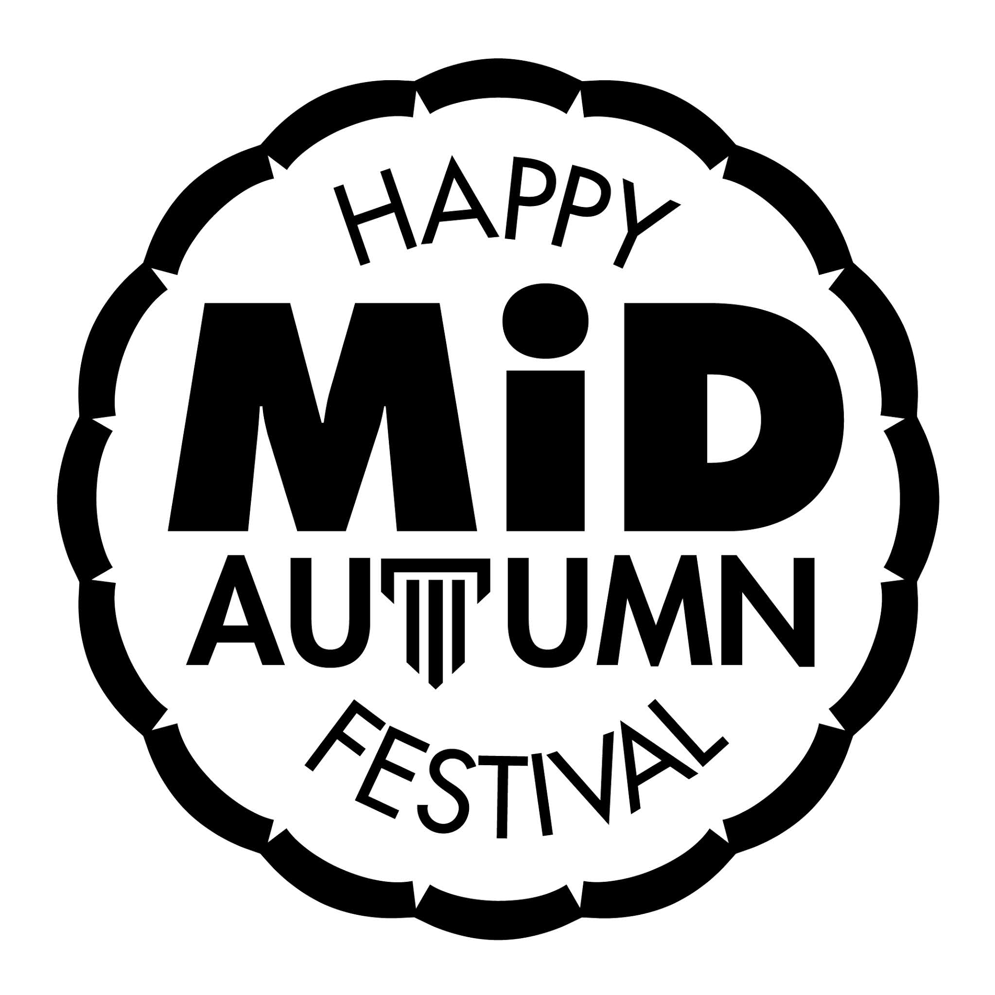
Figure 2.6 First design of mooncake stickers,9th June 2021
By studying this simplify mooncake silhouette, I had an idea to make my mooncake sticker a 3D mooncake to make it more fun and exciting. Improvising the existing design, make it as a solid and added a shadow behind the shape.

Figure 2.7 Inspiration of making 3D mooncake sticker, 9th June 2021

Figure 2.8 Second design of mooncake sticker, 9th June 2021

Figure 2.9 Mooncake colour studies, 9th June 2021


Figure 3.0 3D mooncake sticker with 2 colour palette, 9th June 2021
After receiving feedback from Mr.Vinod, I remove the graphic elements on the mooncake to keep it simple as the mooncake itself consider a huge amount of visual element. Besides, this step also help to improve the readability of "Mid-Autumn". Pro tip for sticker: put 7pt white outline to protect the sticker when placing in different screen background.
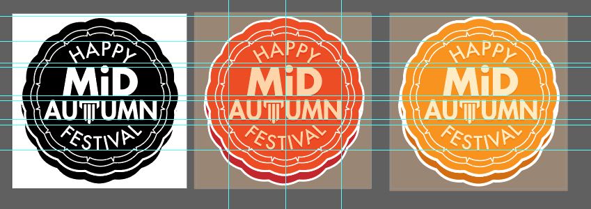
Figure 3.1 New version 3D mooncake sticker, 15th June 2021
Figure 3.2 Before and after for mooncake sticker design, 15th June 2021

Figure 3.2 Before and after for mooncake sticker design, 15th June 2021
Figure 3.3 Process of publishing sticker pack on Telegram, 15th June 2021
5. FINAL SUBMISSION:


Figure 1.0 Final mooncake sticker B&W version, 18th June 2021

Figure 1.1 Final traditional mooncake sticker colour version, 18th June 2021

Figure 1.2 Final egg yolk mooncake sticker colour version, 18th June 2021
Figure 1.3 Publishing Telegram sticker pack (light and dark mode), 20th June 2021
 Figure 1.4 MidAutumn Telegram sticker pack, 20th June 2021
Figure 1.5 Final mooncake sticker pdf version, 20th June 2021

Figure 1.0 Final mooncake sticker B&W version, 18th June 2021


Figure 1.1 Final traditional mooncake sticker colour version, 18th June 2021


Figure 1.2 Final egg yolk mooncake sticker colour version, 18th June 2021
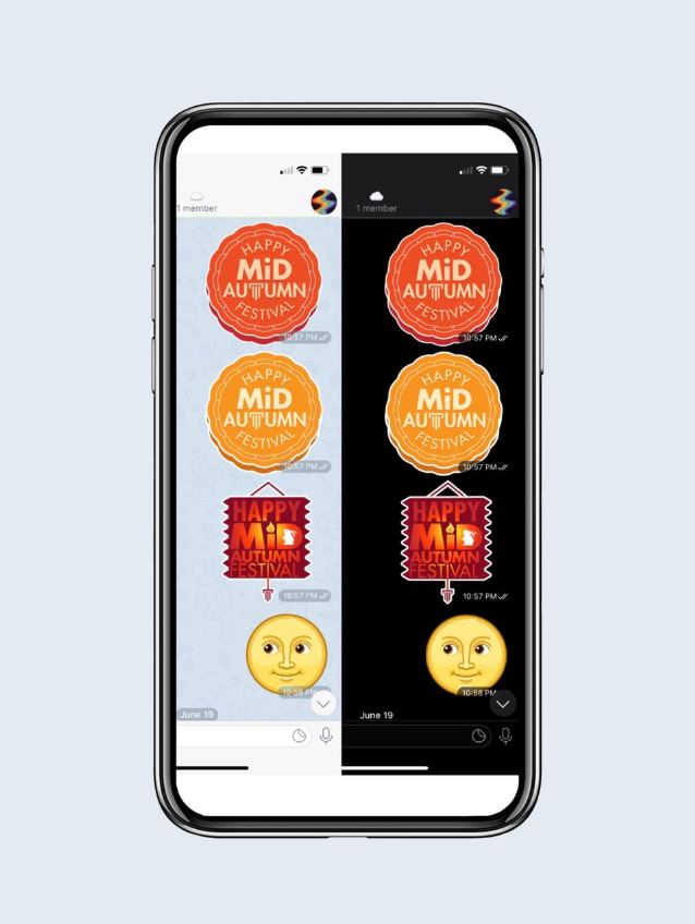
Figure 1.3 Publishing Telegram sticker pack (light and dark mode), 20th June 2021

Figure 1.4 MidAutumn Telegram sticker pack, 20th June 2021
Figure 1.5 Final mooncake sticker pdf version, 20th June 2021
Figure 1.5 Final mooncake sticker pdf version, 20th June 2021
FEEDBACK:
WEEK 11//
General feedback: Expression needs to be simple and impactful. We must develop critical thinking skill to analyse and explain our design. Train yourself to evaluate your designs.
Specific feedback: Mooncake and lantern design concept consider okay (Figure1.3). Replacement of the Taylor logo in the letter T seem to be nice, however, the mooncake elements is too much, can be reduced. For lantern design, the Taylor logo as tassel can be smaller.
WEEK 12//
General feedback: The size, weight, space between the letterform depends on the type of letterform. Once the tracking is right, only move on to add other elements. The sticker needs to add a 7pt outline to protect the sticker design.Specific feedback: The mooncake sticker looks better, kerning and letterspacing between the 'PP' and 'TI' need to be wider. The size of 'Min Autumn' is fine, the colour of the egg yolk version (reddish-orange) seems interesting, can be further explored (Figure 2.9).
General feedback: The size, weight, space between the letterform depends on the type of letterform. Once the tracking is right, only move on to add other elements. The sticker needs to add a 7pt outline to protect the sticker design.
Specific feedback: The mooncake sticker looks better, kerning and letterspacing between the 'PP' and 'TI' need to be wider. The size of 'Min Autumn' is fine, the colour of the egg yolk version (reddish-orange) seems interesting, can be further explored (Figure 2.9).
REFLECTION:
Experience: Creating stickers it's fun for me but creating a typography sticker is a brand new experience for me. This task was also challenging as we were given limitation within the usage of 10 typeface and minimal graphic elements. In this process, I put effort into doing idea exploration and study about the composition. After all the trials and errors, I was pleased to see the final sticker outcome and published on the Telegram sticker pack.
Observation: Through this exercise, I realized typography plays a significant role to connect the idea and message even in the small size. By choosing the right font and considering the size and readability, will give the audience a greater visual impression. In the black and white version, we can analyze the composition better in terms of the font and visual elements.
Finding: In this modern era, stickers are becoming more trendy and they have the power to go viral. It is not only one of the marketing tool yet an entertainment for people, connecting each relationship in a better way. People enjoyed and have fun when they use a digital sticker, making them feel like kids again, happily engrossed in sticker books. The awesome part of the sticker is with a small visual, it can express emotions and thoughts most quickly.
FURTHER READING:
 Figure 1.0 Article on brilliant sticker design ideas,8th June 2021
From this reading, I learned about making the font the focal point if the sticker aims to deliver a message. Big, bold letters or unique typography can help to create the right feeling for the sticker design to make it memorable. I think this is helpful as I would apply the same concept while designing my typography sticker. Furthermore, lighter text placed on darker backgrounds will get absorbed by the background and become difficult to read. If the background of the sticker is darker, a thicker font will help improve legibility.
 Figure 1.1 Article on typography tips for labels,8th June 2021
In this article, I learned about amazing tips in designing labels. In any design, less is always more, if there are too many different fonts is used for each line, the label may dilute the message and causing difficulties for the potential customer to read. I think this can be applied to stickers design as well. The right amount of details will make the design stands out more. In addition, we need to consider 'Form and Function'. Decorative fonts need to be avoided for important information to give clear instruction and good readability. Next, colour contrast helps to draw the attention of the audience directly to the words rather than seeing the design element.

Figure 1.2 Article on Tips to create and print stickers stand out,8th June 2021
Next, is about how to make sticker design pop with colours. It can be any colour of the palette however, it is crucial for designers to choose the right colour to suit the purpose of the sticker, whether it's for a festival, business or entertainment. For example, a bright and colourful sticker reflects happiness and it grab gives a positive emotion which is relevant for my sticker theme' Mid Autumn'.

Figure 1.0 Article on brilliant sticker design ideas,8th June 2021
From this reading, I learned about making the font the focal point if the sticker aims to deliver a message. Big, bold letters or unique typography can help to create the right feeling for the sticker design to make it memorable. I think this is helpful as I would apply the same concept while designing my typography sticker. Furthermore, lighter text placed on darker backgrounds will get absorbed by the background and become difficult to read. If the background of the sticker is darker, a thicker font will help improve legibility.

Figure 1.1 Article on typography tips for labels,8th June 2021
In this article, I learned about amazing tips in designing labels. In any design, less is always more, if there are too many different fonts is used for each line, the label may dilute the message and causing difficulties for the potential customer to read. I think this can be applied to stickers design as well. The right amount of details will make the design stands out more. In addition, we need to consider 'Form and Function'. Decorative fonts need to be avoided for important information to give clear instruction and good readability. Next, colour contrast helps to draw the attention of the audience directly to the words rather than seeing the design element.
Figure 1.2 Article on Tips to create and print stickers stand out,8th June 2021
Next, is about how to make sticker design pop with colours. It can be any colour of the palette however, it is crucial for designers to choose the right colour to suit the purpose of the sticker, whether it's for a festival, business or entertainment. For example, a bright and colourful sticker reflects happiness and it grab gives a positive emotion which is relevant for my sticker theme' Mid Autumn'.


Comments
Post a Comment