DIGITAL PHOTOGRAPHY AND IMAGING// PROJECT 4

31.05.2021-21.06.2021//Week 10-WEEK 13
Chaw Zhi Ting (0347344)
Bachelor of Design (Hons) Creative Media
Digital Photography and Imaging//Project 4
Bachelor of Design (Hons) Creative Media
Digital Photography and Imaging//Project 4
PROJECT THEME//SELF-TITLEDSelf-titled is an exploration project for the students to express their own individuality and reflect their personality into digital art self-expression. The main idea is to build up self-confidence and discover their interest.
PART (A)//BIOGRAPHY
1. Tell us about yourself
An ordinary girl came from a small town to the city to pursue her dream. She dreamed to be a good designer and able to help people in need. She is excited to explore this wonderful world.
An ordinary girl came from a small town to the city to pursue her dream. She dreamed to be a good designer and able to help people in need. She is excited to explore this wonderful world.
2. What is your passion?
She wanted to spread happiness to the world through art, bringing joy and colours to others people in life. Lighten them up through the darkness. This is one of the reasons why she enjoyed volunteering because seeing them smile is the best gift for her.
3. What’s motivate you to achieve your dream?
Life is short, we should live life to the fullest do something meaningful to add value to our lives. As the saying goes “do good and the good will come to you”, my parents taught her to be kindhearted to people since she was young.
4. How do you want to visualize your dream into an artwork?
Using a simple and organic way to convey the message of spreading positivity. We all can be the one who make a change.
PART (B)//DESIGN IDEA
1. Tell us about your work
It is about a girl who try her best on making a small impact of the world. It may seem challenging but she believes when there is a will, there is a way.
2. What is the concept behind it?
The design aims to reflect spreading hope and positivity in life. Each of us is unique and we can do small impact by helping others or giving emotional support. Instead of dimming our light to make others feel more comfortable, we could just continue to shine and foster the rise of the vibrations of those around us.
3. What is the message you want people to understand it?
Appreciate little things in life and enjoy every moment. Shine your light and make a positive impact on the world. Don't be afraid to shine because the world needs your light.
4. What is your motto/ quote?
“Be the light in the darkness”
“Shine your light.”

Figure 1.0 Poster moodboard, 31 May 2021
1. POSTER DESIGN
#Design 1
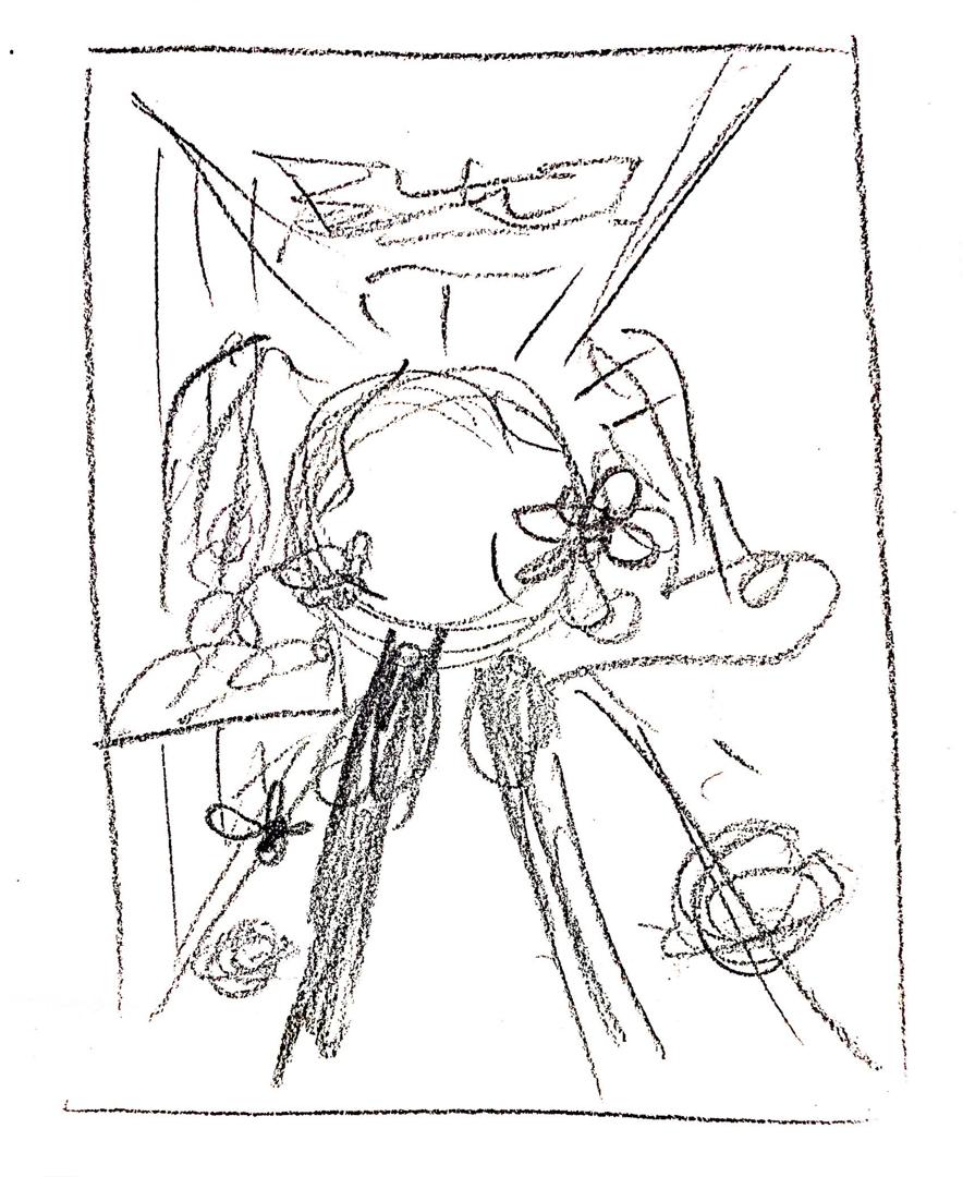
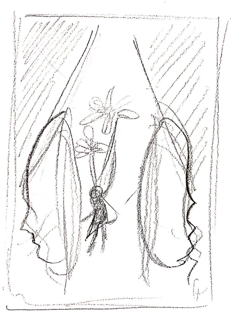
Figure 1.1 First idea sketches, 31 May 2021


Figure 1.2 First digital composition, 31 May 2021
Mr.Fauzi gave me feedback, the first composition is lack of 'self identity' and the message is not strong.
May need further exploration and it's better to put own 'face' in the composition.
#Design 2
Then I move on to another sketch which is 'a girl dancing in the dark' which reflects my concept be the light in the dark.

Figure 1.3 Second sketch, 1st June 2021


Figure 1.5 Second digital composition 'Be the light', 1st June 2021
#Design 3
This design aim to combine the natural elements and the concept of 'shine your light'. The first element that sparked in my mind was sunflower. I loved sunflower very much as it symbolize hope, happiness and positivity. So I decided to add sunflowers as my main poster deco.

Figure 1.6 Third sketch, 1st June 2021
As I need a portrait for this poster, I try to set my camera at my balcony and try out different posture to capture the sunlight. I realized taking own photo is tough but I did enjoy the process. After taking tons of picture, I went through all the photos and selected the best ones to see which might suit my concept idea.

Figure 1.7 Photography process, 1st June 2021

Figure 1.8 Colour correction, 1st June 2021
After doing some minor colour correction, I masked my face and created a gradient filled behind it to make 3D and surreal. As the picture I took was not a full body picture, I think of ways to position the sunflower to cover the 'incomplete' parts.

Figure 1.9 Masking and crop the photo, 1st June 2021

Figure 2.0 Adding natural element 'Sunflower', 1st June 2021
First, I wanted my poster to glow in dark to portray the concept of 'be the light in the darkness'. However I realized it does really convey the message when looking at it. Aside from that, the colour chosen was too strong for all the elements causing distraction.


Figure 2.1 First and second attempt with dark background, 1st June 2021
By changing to a softer colour palette, the milky yellow, the objects in the foreground and midground becoming more outstanding. To add more detail to the poster, I decided to add some hand-drawn elements (the flower crown and some plants in my head). Besides, I added newspaper texture on the sun behind me which also represent a hat of mine.

Figure 2.2 Third attempt with yellow colour palette, 8th June 2021

Figure 2.3 Newspaper texture, 8th June 2021

Figure 2.4 Radial effect on the background, 8th June 2021
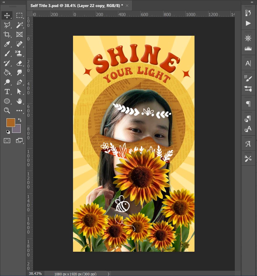
Figure 2.5 After adding radial background, 8th June 2021


Figure 2.6 Try adding glossy effect, 8th June 2021
After having feedbacks from Mr.Fauzi, I decided to 'keep it simple' by removing the glossy effect on the surface. Besides, I adjusted the typography to make it more space. The sun (round yellow) also act as a hat of mine, is adjusted slightly smaller to fit in the frame.

Figure 2.7 Final chosen poster, 8th June 2021

Figure 2.8 Bee buzzing key frame, 10th June 2021 Figure 2.9 Masking the sunflower to animate rotation, 10th June 2021
 Figure 3.0 The movement for the shine background, 10th June 2021
Figure 3.1 First draft of animation, 10th June 2021
2. ANIMATION
After finalizing the composition, I started to animate the sunflowers to make them look alive as if they are shaking their bodies with rhythm. Using the techniques I have learned from the previous exercise which is masking, rotation and adjusting the opacity. Then, I set the path for the bee to buzz around the beautiful flowers and duplicate the keyframes to make it loop.

Figure 2.8 Bee buzzing key frame, 10th June 2021


After receiving feedback from Mr. Fauzi, I improved the animation by utilizing the puppet tool to add movement of hand-drawn plants. It looks more natural and gives a more relaxing atmosphere. Besides, I used 'cc light sweep' effect to provide a glossy appearance to the typography. It was fun to experiment with different light angles, intensities, and positions to see what new effects I could come up with. I'm delighted I was able to get the metallic finish for the text after a few attempts.

Figure 3.2 Using puppet pin to animate the hand-drawn plants, 21st June 2021

Figure 3.3 Applying light sweeping effect, 21st June 2021
3. FINAL SUBMISSION

Figure 3.4 Final self -titled poster, 25th June 2021
Figure 3.5 Final self-titled animation, 25th June 2021
Life is a journey filled with many challenges and hurdles. We should never forget to appreciate the simple things in life and to cherish every moment. I portray myself as a sunflower, commonly known as "happy flowers," because my passion is to spread happiness to the world. We are all meant to shine as children do. As we let our light shine, we unconsciously permit other people to do the same. If each of us is willing to spread love and share happiness, the world would be a better place!
FEEDBACK:
WEEK 11//
Poster reference are good, the concept and idea is okay, However the first draft of poster I did is too general and it looks like random collage. The choice of elements have to be more specific and reflect own personality.
Poster reference are good, the concept and idea is okay, However the first draft of poster I did is too general and it looks like random collage. The choice of elements have to be more specific and reflect own personality.
WEEK 12//
The poster is nice and it reflect the concept. Visual impact of the self potrait can be enhance by adjusting the 'level' in photoshop.
WEEK 13//
When it comes to InstaStory, the font and the background circle can be made smaller to give the composition more space. Overall, the animation is good, and the soundtrack is appropriate. What can be improved is utilizing the puppet tool to alter the hand-drawn flower to make it move more lively and adding a shiny effect to the typography to reflect the meaning of the word.
REFLECTION:
Through the process project, I have better discover myself and have a clearer direction what I want to achieve in life. Finding a way to express ourselves through art is quite challenging. In addition, it requires a lot of thinking process and creative ideas choose the right element to make it surreal. I am delighted that I was able to convey my message in the poster, step by step. Starting with concept sketches, learn how to take decent photos, and then move on to editing and animation. This is a challenging but enjoyable process. After having some experience from the last exercise, I'm glad the animation process went a little more smoothly this time. It was fantastic to pick up some new effects especially 'cc light sweep' which I applied on the typography. Overall, I was impressed with what I learnt in this subject and I'm sure there's still a lot more to discover!


Comments
Post a Comment