TYPOGRAPHY// TASK 3(A)
 25.05.2021-01.06.2021(Week 9- Week 10)

Chaw Zhi Ting (0347344) Bachelor of Design (Hons) Creative MediaTypography // Task 3(A)
Chaw Zhi Ting (0347344)
Bachelor of Design (Hons) Creative Media
Typography // Task 3(A)
LECTURES:
Mr.Vinod demonstrated the process of designing letterforms and how to develop sketches starting from the existing font. It was a fun journey to study the parts of the ideal letterforms by deconstructing the alphabets. Then studying the pattern and parts of the font, we can slowly modify or designing our fonts.
Mr.Vinod demonstrated the process of designing letterforms and how to develop sketches starting from the existing font. It was a fun journey to study the parts of the ideal letterforms by deconstructing the alphabets. Then studying the pattern and parts of the font, we can slowly modify or designing our fonts.

Figure 1.0 Example of deconstruction letter r by Mr Vinod, 11th May 2021
 Figure 1.1 Example of constructing letters from sketch, 11th May 2021
 Figure 1.2 Comparing the design with reference as guide , 11th May 2021
In the pre-recorded tutorials, we learned about how to transfer our fonts from Illustrator to Fontlab. First, we have to unite the parts of the letter using the pathfinder tool, then create an outline stroke. After that, adjusting the axis in Ai when copying the letter. After done pasting all the letters, we need to adjust the kerning and space between pairs of letter to make them more visual appealing.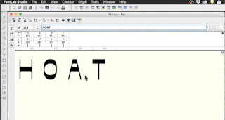
Figure 1.3 Tutorial of transferring designed font to FontLab , 25th May 2021
INSTRUCTIONS:TASK 3A : TYPE DESIGN AND COMMUNICATION
Before starting designing the letterforms, I start to deconstruct the some of the letters, such as 'i' , 'g' and 'b'. By studying the letter parts of the type, I have a better idea on constructing my own type design.
Figure 1.0 Reference of deconstructing letter, 18th May 2021

 Figure 1.1 Deconstruction of letter i,g,b of ITC New Baskerville Std , 18th May 2021Figure 1.2 Type design references from Pinterest, 18th May 2021
After doing some researches, I started my brainstorming and sketches progress. I had an idea on transforming existing objects or item into a type, it will definitely be interesting.
DESIGN #1
This design is inspired by Chinese coin they use in the old days, at first I design the counter space with a normal square. However, I find it a little boring so I twisted the angle to make it look like diamond shape. I tried to include this feature to all the letters including coma, fullstop and exclamation to make it iconic.

Figure 1.3 Inspiration and sketches for coin type design , 18th May 2021
Figure 1.4 Process of creating font with Futura std as reference, 18th May 2021
Figure 1.5 Process of creating font with Futura Std as reference, 18th May 2021

Figure 1.6 Digitalize 'Diamond' type, 18th May 2021
DESIGN #2
The reason why I pick coffee bean is I thought of designing font that can be use by café or restaurant. Besides, the tiny little coffee bean have an interesting texture and pattern itself. I began sketching out with the 's' as the counter space and some wavy pattern for the ascender and descender.
 Figure 1.7 Coffee bean inspiration from google, 18th May 2021
Figure 1.8 Sketches for coffee bean type, 18th May 2021
 Figure 1.9 Digitize coffee bean type, 18th May 2021
 Figure 2.0 Compilation for feedback session, 25th May 2021
After receiving feedbacks from Mr.Vinod and Mr.Shamsul, coffee bean type has been chosen. Therefore, I work on it to standardize and improve the stylization and consistency of the type.
Figure 2.1 Comparison of the type after amendments, 28th May 2021 Figure 2.2 Wireframe version (before and after, 28th May 2021
 Figure 2.3 Identify the baseline, x height, ascender and descender height, 26th May 2021

Figure 2.4 Final font design , 28th May 2021
As I am satisfied with the font design, I moved them to the Fontlab to generate as open type. 
 Figure 2.5 Creating name in Fontlab 'CoffeeBean' and changing Font settings, 28th May 2021
Figure 2.6 Axis guide before pasting in FontLab, 28th May 2021
Figure 2.7 Axis guide before pasting in FontLab, 29th May 2021

Figure 2.8 Process of kerning letterforms, 29th May 2021

Figure 2.9 Process of kerning between pair letterforms, 29th May 2021
Figure 3.0 Export as OpenType and installed in computer, 30th May 2021

 Figure 3.1 Creating mock up for the font 'Adobe', 30th May 2021


Figure 3.2 Expressing 'I did it', 30th May 2021
WEEK 10// Typography poster
After finalize our font design and generated from Fontlab, we were required to come out a typography poster to display our font. Phase given" I am type god, obey me!"

Figure 3.3 Poster design exploration, 1st June 2021

Figure 3.4 First amended poster, 1st June 2021
Figure 3.5 Further poster design exploration, 1st June 2021

Figure 3.6 Poster 'T' and 'I', 1st June 2021
FINAL OUTCOME

Figure 1.0 Coffeebean font sketches, 1st June 2021

Figure 1.1 Final type design in Illustrator, 1st June 2021 Figure 1.2 Generated font after kerning from Fontlab, 1st June 2021
 Figure 1.3 Final typography poster 'The Coffee Z', 1st June 2021
Figure 1.4 Finalized coffee bean PDF version, 30th May 2021
FEEDBACK:
Week 9: General feedback: Examine the font design with readability, consistency and legibility. It is advised to start designing letter o, as the curve is is related to a and g. Prevent the loop heavier than the main part especially the 't'. Create the main fill, see the proportions.
Specific feedback: Good design exploration with references. The idea of using coffee to develop the design is good, may proceed with that. Letter 'b' needs to be closer to the stem and make sure the pattern of the font is having the same angle and direction. Letter 'e' can be further improved.
Week 10
General feedback: Idea sketches, the process of generating font in Fontlab need to be documented in e-portfolio. Try not to watch tutorial and do it at the same times, this might cause missing of important steps.
Specific feedback: The font design is overall good to go, it shows a little of inconsistency but it may the part of the characteristic. For typography poster, the phrase 'obey me' will be better to put in the same line and slated toward the description.
REFLECTION:
Experience: My overall experience is good during the design process. However, it got complicated and worried when it comes to Fontlab. I faced an issue on the counter of letters is filled when I paste the font. After replaying the tutorials and asking my friends, I realized I missed a step which is changing the settings in preference. It was quite a relief that I manage to sort it out in the end. It was satisfying when the font is done and exported to be used in different usage.
Observations: Type design is truly fun and every tiny detail design of letters counts. Every single change will affect the letter itself, so it's good for us to identify which design direction we are heading and stick to one or two special feature to make it iconic.
Findings: Throughout this task, I have been researching and understanding font design better. This makes me understand the challenges and efforts need to put in. I truly appreciate typographers that created a lot of typefaces that are useful, aesthetic and timeless.
FURTHER READING:

Figure 1.0 Thinking with Type, 18th May 2021Thinking with Type by Ellen Lupton, a good book which provides guidance on alignment, spacing of letters and word, how to ordered and shaped them. I learned the typography essentials such as typefaces and type families, to kerning and tracking, to using a grid. Figure 1.1 Metric and optical kerning, 20th May 2021In this chapter, I learned about metric and optical kerning. Metric kerning is the used of kerning tables that are built into the typeface. The metric kerning in page layout program is the spacing that was intended by the type designer. It usually looks good, especially at small sizes. Optical kerning allow us to analyze the shapes of all characters and adjust the spacing wherever needed.

Figure 1.2 Headlines and logo tracking, 20th May 2021
From this chapter, I understood as text gets bigger, the space between letters expands. In this case, some designers use tracking to diminish overall spacing in large-scale text. Looser tracking is applied to capitals or small capitals, which may appear more slightly apart.

Figure 1.0 Example of deconstruction letter r by Mr Vinod, 11th May 2021


Figure 1.1 Example of constructing letters from sketch, 11th May 2021

Figure 1.2 Comparing the design with reference as guide , 11th May 2021
Figure 1.3 Tutorial of transferring designed font to FontLab , 25th May 2021
In the pre-recorded tutorials, we learned about how to transfer our fonts from Illustrator to Fontlab. First, we have to unite the parts of the letter using the pathfinder tool, then create an outline stroke. After that, adjusting the axis in Ai when copying the letter. After done pasting all the letters, we need to adjust the kerning and space between pairs of letter to make them more visual appealing.

Figure 1.3 Tutorial of transferring designed font to FontLab , 25th May 2021
INSTRUCTIONS:
TASK 3A : TYPE DESIGN AND COMMUNICATION
Figure 1.0 Reference of deconstructing letter, 18th May 2021
Figure 1.3 Inspiration and sketches for coin type design , 18th May 2021
Figure 1.5 Process of creating font with Futura Std as reference, 18th May 2021
Figure 1.6 Digitalize 'Diamond' type, 18th May 2021
Figure 1.8 Sketches for coffee bean type, 18th May 2021
Figure 1.9 Digitize coffee bean type, 18th May 2021
Figure 2.1 Comparison of the type after amendments, 28th May 2021Figure 2.2 Wireframe version (before and after, 28th May 2021
Figure 2.6 Axis guide before pasting in FontLab, 28th May 2021
Figure 2.7 Axis guide before pasting in FontLab, 29th May 2021
Figure 2.8 Process of kerning letterforms, 29th May 2021
Figure 2.9 Process of kerning between pair letterforms, 29th May 2021
Figure 3.0 Export as OpenType and installed in computer, 30th May 2021
Figure 3.1 Creating mock up for the font 'Adobe', 30th May 2021
Figure 3.2 Expressing 'I did it', 30th May 2021
WEEK 10// Typography poster
After finalize our font design and generated from Fontlab, we were required to come out a typography poster to display our font. Phase given" I am type god, obey me!"
Figure 3.3 Poster design exploration, 1st June 2021
Figure 3.4 First amended poster, 1st June 2021
Figure 3.5 Further poster design exploration, 1st June 2021
Figure 3.6 Poster 'T' and 'I', 1st June 2021
Before starting designing the letterforms, I start to deconstruct the some of the letters, such as 'i' , 'g' and 'b'. By studying the letter parts of the type, I have a better idea on constructing my own type design.

Figure 1.0 Reference of deconstructing letter, 18th May 2021


Figure 1.1 Deconstruction of letter i,g,b of ITC New Baskerville Std , 18th May 2021
Figure 1.2 Type design references from Pinterest, 18th May 2021


After doing some researches, I started my brainstorming and sketches progress. I had an idea on transforming existing objects or item into a type, it will definitely be interesting.
DESIGN #1
This design is inspired by Chinese coin they use in the old days, at first I design the counter space with a normal square. However, I find it a little boring so I twisted the angle to make it look like diamond shape. I tried to include this feature to all the letters including coma, fullstop and exclamation to make it iconic.

Figure 1.3 Inspiration and sketches for coin type design , 18th May 2021

Figure 1.4 Process of creating font with Futura std as reference, 18th May 2021

Figure 1.5 Process of creating font with Futura Std as reference, 18th May 2021

Figure 1.6 Digitalize 'Diamond' type, 18th May 2021
DESIGN #2
The reason why I pick coffee bean is I thought of designing font that can be use by café or restaurant. Besides, the tiny little coffee bean have an interesting texture and pattern itself. I began sketching out with the 's' as the counter space and some wavy pattern for the ascender and descender.

Figure 1.7 Coffee bean inspiration from google, 18th May 2021

Figure 1.8 Sketches for coffee bean type, 18th May 2021


Figure 2.0 Compilation for feedback session, 25th May 2021
After receiving feedbacks from Mr.Vinod and Mr.Shamsul, coffee bean type has been chosen. Therefore, I work on it to standardize and improve the stylization and consistency of the type.

Figure 2.1 Comparison of the type after amendments, 28th May 2021


Figure 2.3 Identify the baseline, x height, ascender and descender height, 26th May 2021
Figure 2.4 Final font design , 28th May 2021

Figure 2.4 Final font design , 28th May 2021
As I am satisfied with the font design, I moved them to the Fontlab to generate as open type.


Figure 2.5 Creating name in Fontlab 'CoffeeBean' and changing Font settings, 28th May 2021

Figure 2.6 Axis guide before pasting in FontLab, 28th May 2021

Figure 2.7 Axis guide before pasting in FontLab, 29th May 2021

Figure 2.8 Process of kerning letterforms, 29th May 2021
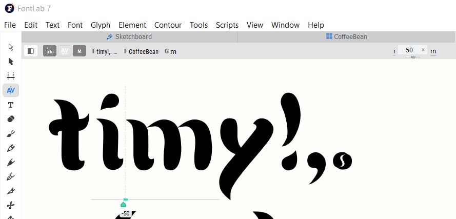
Figure 2.9 Process of kerning between pair letterforms, 29th May 2021

Figure 3.0 Export as OpenType and installed in computer, 30th May 2021


Figure 3.2 Expressing 'I did it', 30th May 2021
WEEK 10// Typography poster
After finalize our font design and generated from Fontlab, we were required to come out a typography poster to display our font. Phase given" I am type god, obey me!"
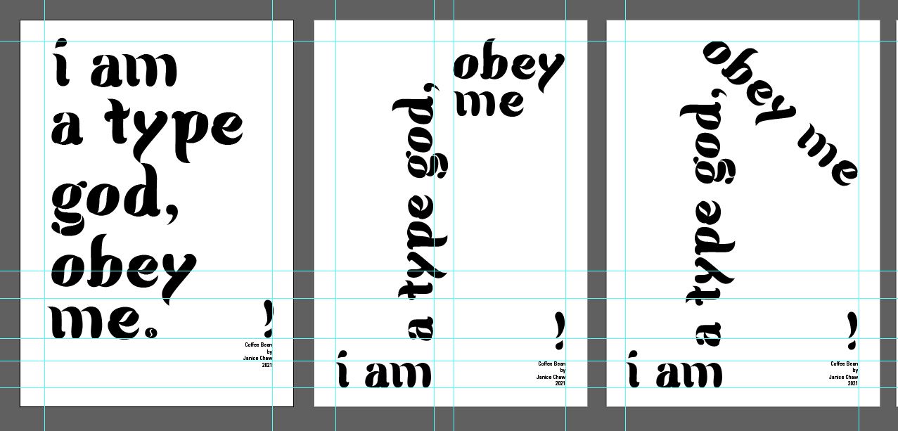
Figure 3.3 Poster design exploration, 1st June 2021

Figure 3.4 First amended poster, 1st June 2021

Figure 3.5 Further poster design exploration, 1st June 2021


Figure 3.6 Poster 'T' and 'I', 1st June 2021
FINAL OUTCOME
Figure 1.0 Coffeebean font sketches, 1st June 2021
Figure 1.1 Final type design in Illustrator, 1st June 2021

Figure 1.0 Coffeebean font sketches, 1st June 2021

Figure 1.1 Final type design in Illustrator, 1st June 2021

Figure 1.2 Generated font after kerning from Fontlab, 1st June 2021

Figure 1.3 Final typography poster 'The Coffee Z', 1st June 2021
Figure 1.4 Finalized coffee bean PDF version, 30th May 2021
FEEDBACK:
Week 9:
General feedback: Examine the font design with readability, consistency and legibility. It is advised to start designing letter o, as the curve is is related to a and g. Prevent the loop heavier than the main part especially the 't'. Create the main fill, see the proportions.
Specific feedback:
Good design exploration with references. The idea of using coffee to develop the design is good, may proceed with that. Letter 'b' needs to be closer to the stem and make sure the pattern of the font is having the same angle and direction. Letter 'e' can be further improved.
Week 10
Week 10
General feedback: Idea sketches, the process of generating font in Fontlab need to be documented in e-portfolio. Try not to watch tutorial and do it at the same times, this might cause missing of important steps.
Specific feedback: The font design is overall good to go, it shows a little of inconsistency but it may the part of the characteristic. For typography poster, the phrase 'obey me' will be better to put in the same line and slated toward the description.
REFLECTION:
Experience: My overall experience is good during the design process. However, it got complicated and worried when it comes to Fontlab. I faced an issue on the counter of letters is filled when I paste the font. After replaying the tutorials and asking my friends, I realized I missed a step which is changing the settings in preference. It was quite a relief that I manage to sort it out in the end. It was satisfying when the font is done and exported to be used in different usage.
Observations: Type design is truly fun and every tiny detail design of letters counts. Every single change will affect the letter itself, so it's good for us to identify which design direction we are heading and stick to one or two special feature to make it iconic.
Findings: Throughout this task, I have been researching and understanding font design better. This makes me understand the challenges and efforts need to put in. I truly appreciate typographers that created a lot of typefaces that are useful, aesthetic and timeless.
FURTHER READING:

Figure 1.0 Thinking with Type, 18th May 2021
Thinking with Type by Ellen Lupton, a good book which provides guidance on alignment, spacing of letters and word, how to ordered and shaped them. I learned the typography essentials such as typefaces and type families, to kerning and tracking, to using a grid.

Figure 1.1 Metric and optical kerning, 20th May 2021
In this chapter, I learned about metric and optical kerning. Metric kerning is the used of kerning tables that are built into the typeface. The metric kerning in page layout program is the spacing that was intended by the type designer. It usually looks good, especially at small sizes. Optical kerning allow us to analyze the shapes of all characters and adjust the spacing wherever needed.
Figure 1.2 Headlines and logo tracking, 20th May 2021
From this chapter, I understood as text gets bigger, the space between letters expands. In this case, some designers use tracking to diminish overall spacing in large-scale text. Looser tracking is applied to capitals or small capitals, which may appear more slightly apart.


Comments
Post a Comment