TYPOGRAPHY// TASK 2

04.05.2021 - 18.05.2021 (Week 6 - Week 8)
Chaw Zhi Ting (0347344)Bachelor of Design (Hons) Creative Media
Typography // Task 2
LECTURES :


Figure 1.0 Analysing uppercase 'A' from Baskerville and Univers, 4th May 2021
Complexity of each individual letterform is neatly demonstrated by examining the lowercase 'a' of two seemingly. Replicating the uniqueness of letterform feature is important when designing letterforms/typeface :begin with one feature.

Figure 1.2 Analysing lowercase 'a' from Helvetica and Univers, 4th May 2021
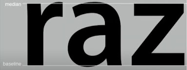 Figure 1.3 Median and baseline of letterforms, 4th May 2021

Figure 1.5 Sample variation of letters, 5th May 2021
INSTRUCTIONS:
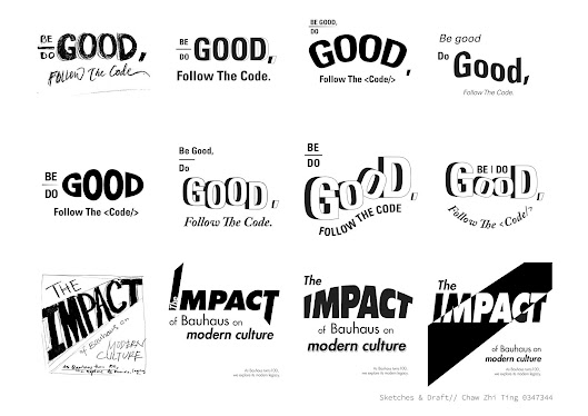
Figure 1.0 Sketches and ideas on the expression of title, 2nd May 2021

Figure 1.1 Reference and inspiration of Bauhaus, 2nd May 2021

Figure 1.2 First design on 'Bauhaus' expression, 4th May 2021

Figure 1.3 First draft for typography exploration, 4th May 2021

Figure 1.4 Second attempt, 5th May 2021

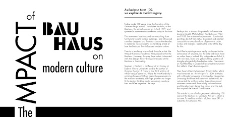
Figure 1.6 Third attempt by applying the new design 'BAUHAUS', 9th May 2021
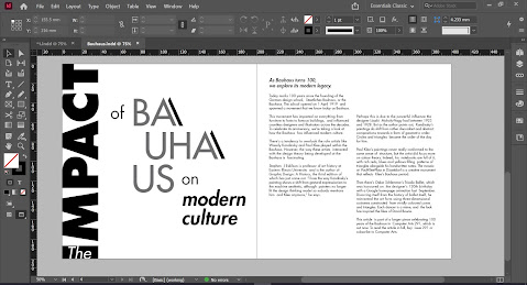
 Figure 1.7 Forth design of text formatting, 9th May 2021

Figure 1.8 Work in progress, 11th May 2021

 Figure 2.3 Final jpg for Bauhaus Type Formatting, 11th May 2021
Figure 2.4 Final pdf submission for Bauhaus Type Formatting, 11th May 2021
REFLECTION:
Week 6// Letters & Understanding letterforms
Asymmetry in Letterforms
Uppercase letterforms may suggest symmetry but are asymmetrical. The obvious differences will be the stroke weights and the less obvious ones will be the arc of the letterform. Each bracket connecting serifs to the stem has a unique arc. The right figure below showing Univers which also appear symmetrical. Looking into detail, the left slope is thinner than the right stroke. Designers need to take care of the harmonious and individual expressive of the letterforms.

Figure 1.0 Analysing uppercase 'A' from Baskerville and Univers, 4th May 2021
Complexity of each individual letterform is neatly demonstrated by examining the lowercase 'a' of two seemingly. Replicating the uniqueness of letterform feature is important when designing letterforms/typeface :begin with one feature.
Figure 1.2 Analysing lowercase 'a' from Helvetica and Univers, 4th May 2021
Maintaining x-height
X-height generally describe size of lowercase letterforms. Some curved strokes must rise above the median line/sink below the baseline, in order to appear to be the same size as the vertical/horizontal strokes they adjoin. For example. a,o,r and s.
X-height generally describe size of lowercase letterforms. Some curved strokes must rise above the median line/sink below the baseline, in order to appear to be the same size as the vertical/horizontal strokes they adjoin. For example. a,o,r and s.

It's important to examine them in close detail. This steps provide a chance to study the balance between form and counter is achieved. Before the process of letter-making, it is essential to case study of the similar existing letterforms.

Figure 1.4 Examination of letter s an g, 5th May 2021

Figure 1.4 Examination of letter s an g, 5th May 2021
*Simple contast produce numerous variations:
Small+organic / large+machined; small+dark/ large light

Figure 1.5 Sample variation of letters, 5th May 2021
"On streets, you look at girl [or boys]. I look at type." I pretty like the quotes that Mr Vinod shared. As a designer, we have to be observant and pay attention to every tiny little thing that might inspire us.
INSTRUCTIONS:
TASK 2 : TYPOGRAPHIC EXPLORATION & COMMUNICATION
After I did some researches, I started to sketch out ideas in my sketch book and drafted some of title in Illustrator. As we were only allowed to use the 10 Typefaces provided, digitalize the words gave a more clearer picture. I went through few attempts and decided to further explore on Bauhaus topic.
After I did some researches, I started to sketch out ideas in my sketch book and drafted some of title in Illustrator. As we were only allowed to use the 10 Typefaces provided, digitalize the words gave a more clearer picture. I went through few attempts and decided to further explore on Bauhaus topic.

Figure 1.0 Sketches and ideas on the expression of title, 2nd May 2021

Figure 1.1 Reference and inspiration of Bauhaus, 2nd May 2021
I started to design this topic with some iconic Bauhaus pattern with lines and shapes. The first design may look stiff and did not turn out well.

Figure 1.2 First design on 'Bauhaus' expression, 4th May 2021

Figure 1.3 First draft for typography exploration, 4th May 2021
After having feedback from the lecturers, I tried tilting the angle to give more dynamic and more relevant to the Bauhaus style.

Figure 1.4 Second attempt, 5th May 2021

Figure 1.5 Design the word expression of 'Bauhaus', 9th May 2021

Figure 1.6 Third attempt by applying the new design 'BAUHAUS', 9th May 2021
For the fourth attempt, I tried to express the word 'IMPACT' instead of 'BAUHAUS'. It still lacks visual impact, so I tried to minimize the other word expression and put more focus on the word IMPACT. I keep reminding and questioning myself "Keep it simple".


Figure 1.8 Work in progress, 11th May 2021

Figure 1.9 Try out different possibility of word expression , 11th May 2021

Figure 2.0 Bauhaus logo references , 11th May 2021
 Figure 2.1 Type formatting draft, 11th May 2021

Figure 2.2 Digitize type formatting, 11th May 2021
Considering the feedbacks from peers, I decided to improve the visual impact of 'IMPACT' by trying out the Bauhaus logo inspiration. It creates more contrast and a clean outcome.

Figure 2.0 Bauhaus logo references , 11th May 2021


Figure 2.2 Digitize type formatting, 11th May 2021

Figure 2.4 Final pdf submission for Bauhaus Type Formatting, 11th May 2021
FEEDBACK:
Week 6:
General feedback// Submission of Text Formatting must be in PDF and JPEG export (High Quality). Screen grabs will not be accepted.
Specific Feedback// The first sketches (Figure1.0) for the title can be better, the body text is good with line spacing and ragging. Besides, the leading text is okay but can consider using the same font with a different weight. The idea of applying Bauhaus design is cool (Figure 1.2) can further explore by tilting the angles to give more movements.
Week 7:
General Feedback// It is important for us to familiarize the typeface we using, the line length, leading.
Specific feedback// Identify and focus one word that you wanted to express. The impact of word expression can be better. I did two designs and the second one is better but the word 'IMPACT' can adjust to improve the visual impact (Figure1.7).
REFLECTION:
Experience: I personally found this exercise is more challenging compared to previous exercise as there are more text to handle. This is because we need to express the title and consider the integration of body text. At the same time, make them interesting and make sure of it's readability.
Observations: It was great to learn from each others artwork in a huge group of class. By observing and critic one's work, we could improve our sensitivity and revise the theory we have learnt. Besides, I was impressed by the creativity of each one to think of out the box of given topic and would create design in various style.
Findings: Before starting the design process, I realized the importance of doing good researches and references. It helped me to improve the understanding of the meaning of the text and convert them to own design. Spending time to read and research for extra material also widen my knowledge and sparked new inspiration.
FURTHER READING:


Figure 1.0 Typographic design form and communication, 6th May 2021

Figure 1.1 Chapter 5 Typography syntax, 10th May 2021


Figure 1.0 Typographic design form and communication, 6th May 2021
Based on Chapter 4, I learned a different type of grids including the square, single and multicolumn grids, modular grids. Square girds are known as natural division just like Japanese tatami. It is often best to set the type as a single block in the linear narrative such as a novel or exhibition panel. The choices of grids are often related to paper sizes and the function of typographic information or even budget. Through observation, practice and experience will help designer nurture own intuitive sense of proportion.

Figure 1.1 Chapter 5 Typography syntax, 10th May 2021
This chapter is about typographic syntax which connects typographic signs to form words or sentences on the page. It all begins with typography basic unit, the letter, and progresses to word, line, column, and margin. Besides, it is known as process of arranging elements into a cohesive whole with good typographic space, visual hierarchy and grid system.

Figure 1.3 Chapter 6 Verbal or Visual Equations, 15th May 2021
In language, signs are joined together to deliver clear messages to the audience. Typography can also evoke meaning through mental association which resulted from the combination of logic and intuitive judgment. For me, I find visual substitution pretty awesome that the visual ear represented letters E, A and R in the design which add a sense of creativity. From the examples given, visual transformation is portrayed with letterforms that are drawn to represent the visual sign of a building, at the same time the spelling for urban futures.


Comments
Post a Comment